Introduction
The first time I tried to draw a building, I stood on a street corner with a cheap sketchbook and made a hopeless mess of it.
My little shopfront looked like a cereal box stood on its end. Flat, dead, wrong. The building in front of me felt tall and solid, and my drawing had none of that.
An older woman watching me said one thing I never forgot. The lines are going somewhere, she said. They meet. Find where they meet and the building will stand up.
She was right, and the fix was almost embarrassingly small. That afternoon I learned that perspective is not a talent. It is a set of rules, and rules can be learned.
This is a gentle walk through two-point perspective. By the end you will have drawn your first honest streetscape.
Why Buildings Look Wrong When You Guess
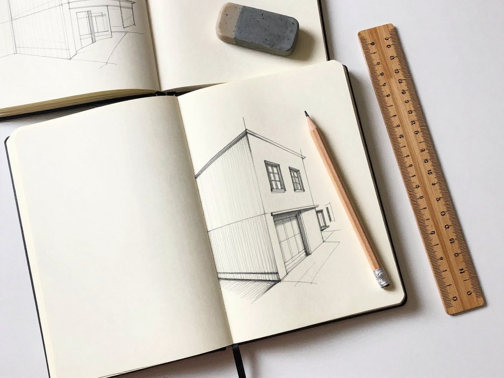
Most beginners draw a corner the way they imagine it rather than the way it actually appears. Both faces get drawn as flat rectangles standing side by side.
The result looks like folded cardboard. The eye cannot find any depth in it, so the building feels thin and lifeless, even when the outline is neat.
Your eye is far smarter than a flat drawing allows. When you look at a real corner, you see two faces turning away from you in two different directions.
One face slides off to the left. The other slides off to the right. Neither one faces you squarely, and that is exactly why the corner feels solid.
That shift is the whole trick. The mind reads those two receding faces as depth, and the building suddenly gains volume on the page.
Draw both faces flat and you rob the eye of that information. Draw them receding and the building stands up, even if your lines wobble and your shading is rough.
The Three Words You Need
Three words carry almost all of two-point perspective. Learn them properly and everything else becomes practice rather than guesswork.
The Horizon Line
The horizon line marks your eye level, and it is the one line you truly must get right. It is not the same thing as the ground beneath your feet.
Stand at a corner and the horizon sits at your eyes, letting you look down at the pavement and up at the shop signs above you.
Sit down on a nearby step and the horizon drops with you. The same building, drawn from that low position, becomes tall and imposing.
The drawing changes because you changed. That is not a fault in your technique. That is the picture honestly recording where you were standing.
The Vanishing Point
A vanishing point is a spot on the horizon where receding edges appear to meet. Every line travelling away from you aims at one of these points.
In two-point perspective you use two of them, one on each side of the page. They usually sit far outside the building itself.
To the left point run all the edges of the left-hand face. To the right point run all the edges of the right-hand face. Nothing crosses over.
Converging Lines
Converging lines are parallel edges that seem to lean toward one another as they travel away from you. Real walls are parallel, but your eye sees them closing in.
Two edges that are genuinely parallel in the world get drawn as lines that meet at the same vanishing point. That single habit fixes most broken buildings.
One-point versus two-point perspective is simpler than it sounds. One-point uses a single vanishing point, and you face a wall straight on.
Two-point uses two vanishing points, and you face a corner. Straight-on views feel calm and formal, like a stage set.
Corner views feel lively and dimensional, like standing on an actual street. Buildings are almost always drawn the second way.
Placing Your Two Vanishing Points
Start with the horizon line, not the building. Draw it lightly across the paper, roughly a third of the way up for a calm, comfortable view.
Now place your two vanishing points near the far edges of the paper, as far apart as the sheet comfortably allows. Mark them faintly.
Here is the part most beginners get wrong. Place the two points close together and the building warps. Its sides bow out and the corners stretch.
The whole thing starts to resemble a fisheye lens. Points set wide apart give calm, photographic results instead.
Wide points keep the receding lines gentle and the building keeps believable proportions. Space between the points is your friend.
When room is tight, one practical trick saves the day. Tape two small marks to the table at the edges, where the vanishing points would fall.
Stretch a piece of taut string from that mark to your pencil, or hold a long ruler steady. Run the pencil along it and the receding line comes out dead straight.
A taut string is faster than a ruler for long edges that sweep right across the page. Keep the construction lines light, because they are only scaffolding.
Building the First Corner
This is the moment it all connects. Follow these steps slowly, and do not worry about neatness at this stage.
- Draw your horizon line lightly across the page.
- Mark a vanishing point near the left edge and another near the right edge.
- Draw the nearest vertical corner line, and keep it perfectly vertical.
- Verticals never lean in two-point perspective. This is the most useful rule you will learn.
- From the top and bottom of the corner line, draw receding lines to the left vanishing point.
- From those same two points, draw receding lines to the right vanishing point.
- Choose the depth of the left face, mark it, drop a vertical, and close that face.
- Choose a different depth for the right face, so the two sides are not identical, and close it too.
- Close the roof with lines returning to each vanishing point, then erase construction lines lightly.
The nearest vertical edge usually seems the tallest line in the drawing, even when it isn't truly the tallest. It sits closest to your eye.
That is why it reads as the strongest, most upright edge in the whole scene. Give it a firm, confident line and the building already feels stable.
Adding Doors, Windows and Rooflines
Now come the details, and this is where beginners quietly undo all their good work. A window is not a flat rectangle stuck onto the wall.
It sits inside the wall, so it recedes with that wall. Every window and door edge must travel to the same vanishing point as the face it belongs to.
Draw the top and bottom of a window as receding lines, never as flat horizontal ones. A flat one will look pasted on like a sticker.
The most common absolute error is a door drawn as an upright, flat rectangle. It flattens everything around it and the wall loses its depth.
A roofline tells the story of the building. If the roof is flat, you simply return the top edges to each vanishing point and stop.
If it is gabled, the roof rises to a ridge. That ridge runs along the length of the building and disappears toward one vanishing point.
Move the apex a little and watch the character change. A tall, steep gable looks like a cottage.
A shallow one looks like a warehouse or a workshop. Shift the ridge left or right of centre and the building turns lopsided or grand.
Small decisions at the roof change the whole personality of the street. That is where a line drawing starts to feel like a place.
A Street, Not Just a Building
One building is a good exercise. A street is where the drawing starts to breathe, and the method barely changes at all.
Draw a second building beside the first, sharing the same two vanishing points and the very same horizon line.
Everything must agree, or the street looks broken. Give each building its own depth and a slightly different height.
Real streets are not made of identical boxes, and a little variety reads as truth. Keep the tallest one for the nearest position.
Use overlap to show distance, not detail. A near building simply hides part of the one behind it, and your eye understands that instantly.
Resist the urge to add more windows to prove depth. Overlapping shapes do the job with far less work and a much more convincing result.
Keep every vertical truly vertical. This one discipline makes the whole street feel upright, as though it stands comfortably on the pavement.
Place the pavement edge early, before the buildings get crowded with detail. A single line running to the vanishing point anchors the scene.
It tells your eye where the ground sits and gives every building a base to stand on. Add it first and the rest falls into place.
Life and Light
A street with no people can feel like a film set after everyone has gone home. One or two figures at the pavement line bring it quietly back to life.
Keep them at a believable scale. For a person of average height, the top of the head sits near the horizon line, wherever they stand.
Draw a small upright shape with its head close to the horizon and its feet on the pavement. That placement keeps the figure from looming.
Size changes with distance, so a figure further along the street is drawn smaller, and one closer is drawn larger.
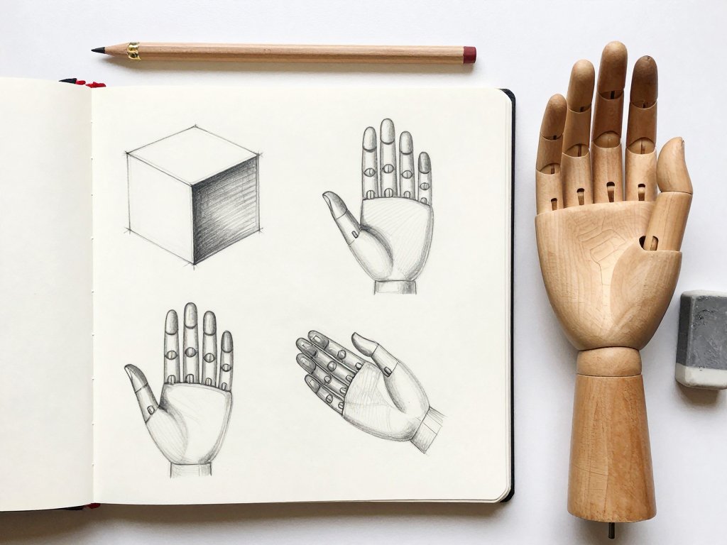
If figures feel like a stretch, they follow the same logic as drawing hands with simple structure and proportion. Structure first, small observations after.
Get the proportion right and the details look after themselves. The same is true of a person standing on a pavement in your street.
Now add light. Choose one direction and let it stay there for the whole drawing. Keep one side of every building in shade and the other lit.
The street instantly reads as three-dimensional. A simple directional shadow does more for depth than any amount of fussy detail.
Decide where the sun sits, then stay loyal to that decision from the first building all the way to the last.
Common Beginner Mistakes
Almost every ruined streetscape comes down to one of these five small slips. Knowing them in advance saves a lot of erasing.
- Verticals drawn leaning. Every upright edge stays perfectly vertical, and a leaning one collapses the whole illusion.
- The two faces given unequal heights. Both faces share the same top and bottom lines, so they cannot be different heights.
- Windows drawn flat. A window belongs to the receding wall and must obey the same vanishing point as everything around it.
- Vanishing points placed too close. The building warps into a fisheye curve instead of looking calm and photographic.
- Drawing too small on the page. Large drawings forgive small errors, and a generous sketch is easier to judge and fix.
Your First Streetscape Practice Plan
Three small warm-ups will carry you further than one grand, careful attempt. None of them takes long, and none of them has to be good.
- Find a photograph of a building corner and draw it, working out where the two vanishing points must sit.
- Draw the same corner twice, once with a high horizon line and once with a low one, and notice how the mood changes.
- Sketch a real corner from life in ten minutes without erasing anything at all.
The third exercise is the important one. No erasing means no fussing, and fussing is what makes a drawing stiff and tight.
Speed and looseness are the goal at first. A quick, confident sketch that is slightly off beats a careful one rubbed into grey mush.
Repeat these three little exercises for a week and you will notice your eye changing. Corners on real streets start to look like drawings.
Final Thoughts
My buildings still go wrong sometimes. A wall still leans, a roof still flattens, and I still occasionally draw a door that looks stuck on.
But I know where the lines are supposed to meet now, and that changes everything about how a mistake feels.
A mistake becomes something I can see and quietly correct, rather than a mystery I cannot name.
So take a pencil and find a corner near your home. Stand there for a few minutes and look at where the edges actually travel.
The lines have been meeting all along. Once you notice, you cannot unsee it, and every street you walk down becomes a drawing waiting to happen.