Introduction
I dropped sixty bucks on a set of Micron pens my first month of ink drawing. Premium nibs, archival ink, the whole deal. Then I sat down, cracked open a brand-new sketchbook, and drew a single sphere that looked like a dirty golf ball. The shading was a mess — messy scribbles, inconsistent gaps, no sense of light at all. I blamed the pens. Then I blamed the paper. Then I blamed the universe. None of it was the problem.
The problem was I didn't know how to hatch.
Hatching and crosshatching are the bread and butter of ink drawing. They're not fancy. They're not complicated. But they are the difference between a drawing that looks like a child's doodle and one that actually has depth, weight, and dimension. And here's the best part: you don't need a sixty-dollar pen set to learn them. A ballpoint from the junk drawer will do. That's the kind of budget-friendly truth I wish someone had told me before I wasted my money.
So let's fix that right now.
What Is Hatching, Really?
Hatching is exactly what it sounds like — a series of parallel lines drawn close together to create tone. The closer the lines, the darker the area. The farther apart, the lighter. That's it. That's the entire concept.
But simple doesn't mean easy. Getting those lines straight, evenly spaced, and consistent takes practice. Your first attempts are going to look shaky. Mine did. Everyone's do. Push through it.
The key variables you control are three: spacing, thickness, and direction. Spacing determines value — tight lines read as dark, wide lines read as light. Thickness comes from your pen nib — a 0.05mm nib gives you delicate gray tones while a 0.3mm or 0.5mm lays down bold black lines. Direction affects the feel of the surface you're shading. Horizontal lines feel flat. Vertical lines feel upright. Diagonal lines add energy and motion.
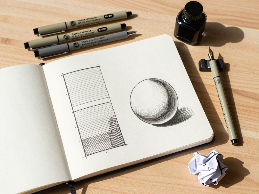
Here's a practical exercise. Draw a rectangle about two inches wide and an inch tall. Divide it into five equal sections. In the first section, draw your lines as far apart as you can while still calling it hatching — maybe a quarter-inch gap. Each section after that should get progressively tighter. The last section should be so dense the lines almost touch. You've just made a basic value scale. This is your new best friend. Practice it until you can do it without thinking.
Crosshatching: Taking It One Layer Further
Crosshatching is hatching, plus a second layer of lines going in a different direction — usually perpendicular, but honestly any angle that isn't parallel to the first set will work. The second layer darkens the area and adds texture.
Think of it like this: hatching gets you 30 percent of the way to a solid black. Crosshatching gets you to 70 percent. If you really need that deep-black shadow, you'll add a third layer at yet another angle, and maybe a fourth.
Common mistake here — and I made this one for weeks — is thinking crosshatching means a perfect 90-degree grid every time. It doesn't. A rigid checkerboard pattern looks artificial. Real crosshatching has slight variation in the angles, tiny irregularities in the spacing. That's what gives it life. A 75-degree angle with a 60-degree angle on top creates a completely different texture than two layers at exactly 90 degrees.
Your second practice exercise: take that value scale you made and hatch a crosshatch layer on top of sections three, four, and five. Section three should get one light layer at a shallow angle. Section four gets two cross layers. Section five gets three layers, each at a different angle. You'll see immediately how crosshatching punches up the darks without needing a thicker pen.
Value Control: The Art of Seeing in Grayscale
Here's where most beginners fall apart. They understand the mechanics — draw lines, draw more lines — but they can't control the values. Everything ends up either too light or too dark, and the drawing looks flat.
You control value with four things: line spacing, line thickness, number of layers, and pressure.
Line spacing is the most obvious. Wide gaps = light. Tight gaps = dark. But here's the trick: you need to be consistent within a single value area. If your light-gray area has lines that are sometimes 2mm apart and sometimes 5mm apart, it'll look like a mess. Train your hand to maintain even spacing. This is muscle memory, not talent.
Line thickness comes from your nib. Use a 0.05mm or 0.1mm for light areas and a 0.3mm or 0.5mm for darker areas. Or — and this is the budget-friendly move — use a single pen and vary the pressure. Lighter pressure with a fine nib gives you thin, delicate lines. More pressure pushes ink out and creates thicker lines. But be careful: pressing too hard damages fine nibs and can scratch the paper. You've been warned.
Number of layers is crosshatching by a different name. More layers = darker. But there's a ceiling. Three or four layers is usually the maximum before the ink pools and your paper starts to pill. That's why paper quality matters, but we'll get to that.
Pressure is the one everybody forgets. Light pressure with a flexible nib creates a tapered line — thin at the start, thick in the middle, thin at the end. This is how you get those beautiful organic hatched lines you see in professional illustrations. Heavy pressure gives you uniform, mechanical lines that work well for technical drawings but feel stiff in organic work.
The five-section value scale from earlier? Do it again. But this time, use only one pen and vary the pressure. Start with feather-light lines in the first section and progressively press harder through to the last. You'll see that a single 0.3mm nib can produce five distinct values just through pressure alone. That's skill. That's control. That's free.
Contour Hatching: Making Your Lines Follow Form
Straight hatching is fine for flat surfaces. But the second you try to shade a sphere, a cylinder, or — God forbid — a human face, straight lines look wrong. The surface feels flat because your lines are flat.
Contour hatching fixes this by curving your lines to follow the shape of the object. A sphere gets curved hatches that wrap around its surface. A cylinder gets vertical hatches that curve slightly at the edges. The lines themselves describe the form.
This is the technique that separates beginners from intermediate artists. It's not about drawing darker in the shadows. It's about drawing lines that bend the way the object bends. Your brain registers those curves as volume. It's almost like a magic trick.
Exercise number three: draw a circle. Now shade it with contour hatches that curve along the surface. The center of the sphere should have relatively flat, horizontal-ish lines. The edges should have lines that curve more dramatically to suggest the sphere turning away from you. Leave the upper-left area nearly blank for your highlight. Build up density in the lower-right for your core shadow. Add one crosshatch layer in the darkest area. You've just drawn a three-dimensional form using nothing but lines.
Stippling: The Slow Cousin Nobody Talks About
I'm going to mention stippling here because it's closely related to hatching and it's useful to know. Stippling is building value with dots instead of lines. Thousands of tiny dots. It produces a softer, more photographic look than hatching, but it takes forever. A single square inch of medium-dark stippling might take fifteen minutes. And stippling doesn't forgive mistakes the way hatching does — one dot out of place in hatching is just a slightly irregular line; one dot out of place in stippling is a visible blemish.
If you're patient and detail-oriented, stippling is worth learning. But for the budget-conscious beginner, hatching gives you more bang for your time. You can hatch a whole page in the time it takes to stipple a thumbnail. That said, combining stippling with hatching — using dots for the lightest transitions and hatches for the main body of shading — is a pro move that looks incredible.
Practical Exercises for the First Week
You don't learn to hatch by reading. You learn by doing. Here's your first week of practice, broken down into ten-minute sessions.
Day 1: Value scale, straight hatching only. Five sections, from light to dark. Keep your lines parallel and evenly spaced. Do this ten times. Yes, ten. It'll take twenty minutes and your hand will cramp. That's the point.
Day 2: Value scale with crosshatching. Same five sections, but add a second layer on sections three through five. Then a third layer on sections four and five. Then a fourth on section five. Try different angles — 45 degrees, 60 degrees, 75 degrees.
Day 3: Simple shapes. Draw five circles, five squares, and five triangles using only hatching and crosshatching for shading. No outlines you can't erase. Just ink. Force yourself to define the shape entirely through shaded areas.
Day 4: Contour hatching on a sphere. Draw one large sphere and practice shading it with curved lines. Then draw a cylinder — a simple can shape — and shade it with vertical lines that curve at the edges.
Day 5: Value matching. Find a grayscale photograph — anything with clear light and shadow, a still life or a portrait works great. Draw a one-inch square section of it using only hatching and crosshatching. Try to match the values exactly. This is harder than it sounds.
Day 6: Speed hatching. Set a timer for five minutes and fill a page with as many different hatching patterns as you can. Don't worry about drawing anything recognizable. Just fill the page with parallel lines, crosshatched sections, curved hatches, and experiments. This loosens up your hand.
Day 7: Small complete drawing. Pick one simple object — an apple, a mug, a leaf — and draw it entirely with hatching and crosshatching. No pencil underdrawing. Commit to the ink. You'll be surprised at how much better it looks than day one.
Common Beginner Mistakes (And How to Fix Them)
Mistake 1: Lines that wander. Your hatches should be confident and straight (or confidently curved for contour hatching). Wobbly, hesitant lines look amateurish. Fix: draw faster. Slow hands shake. Quick, decisive strokes are cleaner. And practice drawing long parallel lines on scrap paper until your arm relaxes.
Mistake 2: Uneven spacing. A value area with inconsistent line spacing looks patchy and chaotic. Fix: slow down and focus on the gap between the last line and the next, not the line itself. Mentally count — one-one-thousand, two-one-thousand — between lines to build rhythm.
Mistake 3: Overworking. You add a layer. Then another. Then another. Pretty soon the ink is pooling, the paper is pilling, and what should have been a subtle shadow is now a black sludge puddle. Fix: stop after three layers. If it's not dark enough, let it dry completely and add one more deliberate layer. Ink on wet ink smears and pools.
Mistake 4: Dirty transitions. A sudden jump from light hatching to dark crosshatching looks like a hard edge, not a smooth gradient. Fix: transition gradually. Start with wide spacing, tighten it over maybe a quarter-inch, then add your first crosshatch layer with wide spacing before tightening that too. Gradual change is the secret to professional-looking work.
Mistake 5: Same angle every time. Some artists get comfortable with 45-degree hatching and never deviate. Every drawing ends up with the same diagonal texture. Fix: force yourself to use different angles for different subjects. Horizontal for skies and water. Vertical for trees and architecture. Diagonal for portraits and organic forms. Vary your approach intentionally.
Recommended Supplies: What to Buy and What to Skip
Let's talk gear. I'm going to tell you what to spend money on and what to absolutely not waste a dime on.
Pens worth your money:
Sakura Micron (around $3 each) — reliable, consistent, waterproof. Get a 0.05mm, a 0.1mm, a 0.3mm, and a 0.5mm. That's four pens. That's about twelve bucks. That's all you need for six months. The 0.05mm is for delicate details and light value areas. The 0.1mm is your daily driver for general hatching. The 0.3mm is for darker areas and thicker lines. The 0.5mm is for your darkest darks and bold outlines.
Zebra Pen G-301 (around $2 each) — budget alternative that writes surprisingly well for hatching. Not waterproof, but if you're not planning to paint over your ink, this is fine. I used these exclusively for my first year and they taught me more than any expensive pen could have.
Copic Multiliner (around $4 each) — premium option. These have alcohol-resistant ink that doesn't budge under markers. The 0.03mm is the finest nib I've ever used, and the brush tip version is excellent for varied line width.
Pens to skip:
Cheap ballpoint pens from the grocery store (bic stick pens, the clear ones). They blob, they skip, and they're inconsistent. Just skip them unless you're desperate and it's all you have — which, hey, is how I started, so no judgment, just know you're fighting an uphill battle.
Gel pens. The ink is too thick and takes forever to dry. You'll smudge half your drawing.
Paper that won't let you down:
Bristol board, smooth finish, 300gsm or above. Strathmore 300 Series is about $12 for a 20-sheet pad. The smooth surface lets your pen glide without catching fibers. The high weight means you can layer three or four crosshatches without the paper warping or pilling.
Mixed-media paper — Canson XL Mixed Media is about $10 for a 30-sheet pad. Slightly more texture than bristol, which gives your ink a subtle tooth. Good for combining hatching with light washes if you ever go that direction.
Marker paper — thinner and smoother than bristol, great for practice because it's cheap. But it pills easily under heavy layering, so stick to two layers max.
Paper to skip:
Printer paper. Too thin, too smooth in a bad way, and it warps with any moisture. Your lines will feather and the paper will buckle. If I had a dollar for every beginner who gave up on ink because they used printer paper and hated the results, I'd be retired.
Watercolor paper (rough finish). The texture catches your nib and makes clean hatches nearly impossible. Good for washes, bad for lines.
Ink:
If you're using disposable pens like Microns, you don't need bottled ink. But if you're using a dip pen (which I recommend once you're past the beginner stage), get Higgins Black India Ink (about $6 for 3 ounces) or Speedball Super Black India Ink (about $7). Both are waterproof when dry, which means you can layer watercolor or marker over your finished hatching without destroying your work. Non-waterproof ink is cheaper but will run the second anything wet touches it — fine for pure ink drawings, frustrating if you ever want to mix media.
Extras that help:
A lightbox or light pad ($20-30 on Amazon). Trace your value scales and exercises to build muscle memory faster. Not essential, but worth it if you have the budget.
Good lighting. A desk lamp with a daylight bulb (5000K-6500K) makes a massive difference in seeing your values accurately. Warm yellow light hides subtle value shifts.
Scratch paper. Keep a stack of cheap copier paper next to you. Do a warm-up hatch scale before every drawing session. It takes thirty seconds and saves you from ruining good paper with a cold hand.
Your Progression Path: From Beginner to Competent
Here's what realistic progress looks like. No fluff, no false promises.
Week 1-2: You can produce clean value scales with both hatching and crosshatching. Your lines are mostly straight and evenly spaced. Simple shapes (spheres, cubes, cylinders) look recognizable and have clear light logic.
Week 3-4: You start adding contour hatching to your shapes. Your spheres actually look round. Your crosshatching doesn't turn into a muddy mess. You can do a small still life with two or three objects and it looks intentional, not accidental.
Month 2: You're comfortable combining hatching, crosshatching, and contour hatching in a single drawing. You understand value matching and can reproduce the tonal range of a photograph. Your lines are confident and you make fewer mistakes. You've developed a natural rhythm.
Month 3 onward: You're not thinking about the mechanics anymore. You're thinking about composition, lighting, and expression. Hatching is now a language you speak fluently, not a technique you're struggling to learn. You can look at a complex subject — a face, a landscape, an architectural scene — and immediately know which angles, spacing, and layering strategies to use.
This timeline assumes about fifteen minutes of daily practice. If you do more, you'll get there faster. If you skip days, you'll stagnate. Consistency beats intensity every single time. Ten minutes every day is better than an hour every Saturday.
Final Thoughts
Hatching and crosshatching are not trendy. They're not new. They've been around for centuries because they work. Rembrandt used them. Van Gogh used them. Every professional comic artist you've ever admired uses them. The technique is timeless for a reason.
The best part? You already have everything you need. A pen. Some paper. Fifteen minutes a day. That's not a supply list. That's permission to start right now without spending another dollar.
So put down this article, grab whatever pen is closest, and draw five parallel lines on the nearest piece of paper. Then five more right next to them, slightly closer together. Then five more. That's it. That's the entire journey, one set of lines at a time.
I wish someone had told me that before I spent sixty dollars on pens I didn't need. Now you know better. Go make something.