Introduction
I still remember the first colored pencil set my grandmother gave me when I was seven years old.
It came in a tin box with a hinge that never quite closed right, and it held twenty-four pencils in shades I had no idea what to do with.
I colored everything in flat, solid blocks — the sky was one shade of blue, the grass one shade of green, and the sun was a heavy, waxy yellow that left a greasy sheen on the page.
I loved those drawings anyway, because I did not know that colored pencils could do more than fill in outlines.
It took me another twenty years to learn that colored pencils are not crayons. They are closer to watercolor in how they behave — layer upon layer, building depth slowly, revealing the paper through the pigment rather than hiding it.
The moment I understood that, everything changed. A simple apple drawing went from a red blob to something that actually looked round, with highlights and shadows and a sense of sitting on the table in front of me.
This guide walks you through the two techniques that made that apple possible: blending and layering. If you have a basic set of colored pencils and some paper, you already have everything you need to start creating drawings with real depth and dimension.
Choosing Your Supplies Without the Overwhelm
Before we get into technique, let me save you the confusion I felt staring at the art store display wall.
You do not need a sixty-pack of premium pencils to learn blending and layering. A basic set of twelve to twenty-four student-grade pencils will teach you everything you need to know.
The most important quality in a colored pencil is how well it lays down pigment.
Some cheap pencils feel hard and scratchy, and they leave gaps in the color no matter how many layers you add.
If your budget allows, I recommend starting with a set of Prismacolor Premier or Faber-Castell Polychromos pencils in a small tin.
The Prismacolor pencils are softer and blend more easily, which makes them ideal for beginners.
A twelve-pack costs about fifteen to twenty dollars and covers the essential color range.
For paper, you want something with a bit of tooth — a surface that grips the pigment rather than letting it slide around.
A sketchbook labeled "suitable for colored pencil" or "multi-media" works well. Strathmore's colored pencil paper or their 400 Series drawing paper are both excellent choices at about eight to ten dollars for a pad.
Avoid smooth printer paper, which cannot hold enough pigment layers to produce deep, rich color.
And one more thing: a kneaded eraser. Not a pink eraser that tears the paper.
A soft, gray kneaded eraser that lifts pigment gently without damaging the surface underneath. They cost about two dollars and last for years.
You will use it to create highlights and correct small mistakes as you layer.
Understanding How Colored Pencils Behave
Here is the most important thing I learned about colored pencils: they are translucent. Each layer of pigment lets some of the paper and the layers beneath show through. This is not a limitation. It is the feature that makes blending and layering work.
Think of it like stacking sheets of colored tissue paper on a white table. One sheet of yellow looks pale.
Add a sheet of red on top, and you get orange where they overlap. Add another sheet of blue, and that area turns brown.
The table surface — your paper — stays visible through all of them, reflecting light back up through the pigment layers and giving the final color a luminous quality that paint cannot replicate.
This translucency means two things for how you draw. First, you always work from light to dark.
A light yellow base layer cannot cover a dark blue line, but a dark blue line over yellow works beautifully.
Second, you build color gradually. You cannot lay down one heavy layer of red and call it done.
You build it in thin passes, letting each one dry and settle before adding the next.
The Foundation: Pressure Control
Before you blend anything, you need to learn how much pressure to use. This was the skill that took me the longest to develop, because I was used to pressing hard with crayons and pens. Colored pencils reward a light touch.
Hold your pencil at a shallow angle — about thirty to forty-five degrees from the paper — rather than holding it straight up like you are writing.
This puts more of the pencil tip in contact with the paper, which lays down wider, softer strokes.
It also reduces the pressure you naturally apply because your hand is in a more relaxed position.
Try this exercise. Take a light blue pencil and shade a small square using the lightest pressure you can manage while still seeing color on the page.
Then shade another square next to it with slightly more pressure. Keep going until you have a row of five squares ranging from barely visible to as dark as you can make the pencil go.
This is your pressure scale, and you will refer back to it constantly as you learn to blend.
The lightest two or three levels of pressure are where most of your blending happens.
The heaviest pressure is reserved for small accent areas — the darkest shadows and the most vivid color notes.
If you press hard everywhere, you lose the ability to create depth because there is nowhere softer to go.
Layering: Building Color from the Ground Up
Layering is the process of building color by applying multiple thin passes of pigment on top of each other. Each pass adds more pigment to the paper tooth, gradually filling in the tiny valleys of the paper surface until the color looks smooth and solid.
Here is how I approach a simple layering exercise. I draw a circle about two inches across — my practice sphere.
I decide that the light comes from the upper left. I take a light blue pencil and shade the entire circle with very light pressure, leaving only a small crescent in the upper left completely white.
This first layer is so light that it barely looks blue, but it establishes the base tone.
Next, I take a medium blue pencil — one step darker on the color spectrum — and add a second layer, this time only covering the area that will be in shadow.
I leave the lighter half of the sphere with just the first layer. The two blues mix visually, creating a darker tone where they overlap.
For the third pass, I use a dark blue or even a navy pencil, and I apply it only to the deepest shadow area — the lower right edge of the sphere.
By now, that area has three layers of pigment, and the color is rich and deep.
The light area has one thin layer, and the highlight has none.
This is the full layering process in its simplest form. Do this with any color — red apple, green leaf, orange flower — and you get a three-dimensional object every time.
Blending: Making the Layers Disappear
Layering gives you depth. Blending gives you smoothness. The two techniques work together: you layer to build the color, then you blend to soften the transitions between layers.
There are several ways to blend colored pencils, and each one produces a slightly different effect. I will walk you through the three I use most often.
Burnishing: The Heavy Hand Method
Burnishing is the technique of applying heavy pressure with a light or white pencil over your finished layers to press the pigment into the paper and create a smooth, shiny surface.
It works best after you have built up several layers of color. Take a white or cream pencil and rub it firmly over the entire colored area using a circular motion.
The pigment below gets pressed flat into the paper tooth, filling all the tiny gaps and creating a smooth, polished look.
Burnishing is ideal for subjects that should look glossy — fruit, glass, metal, wet surfaces. It does change the texture of your drawing, so use it deliberately. On a matte surface like fabric or tree bark, burnishing would look unnatural.
The one caution: once you burnish, you cannot add more colored layers on top. The paper tooth is full, and new pigment will not stick. Save burnishing for the final step of your drawing.
Solvent Blending: The Subtle Approach
This technique uses a small amount of odorless mineral spirits or rubbing alcohol on a brush or cotton swab to dissolve the pencil binder and spread the pigment smoothly across the paper.
It produces a watercolor-like effect without the water, and it preserves the paper tooth so you can keep layering on top.
Apply a few layers of color first — three to four thin passes. Dip a small brush or cotton swab into odorless mineral spirits, blot it on a paper towel so it is damp rather than wet, and gently stroke it over your colored area.
The pigment melts into the paper, filling gaps and creating a smooth, even surface. Let it dry for about thirty seconds, then add another layer of color on top.
The results are stunning.
I use this technique for backgrounds, skies, and any large area where I want a smooth gradient without visible pencil strokes. It is also excellent for portraits, where skin needs to look soft rather than textured.
Work in a well-ventilated area when using solvents, and test on a scrap piece of paper first to make sure your paper can handle the moisture without buckling. Most 100gsm or heavier paper handles it well.
Layered Blending: Just Pencils, No Solvents
If you prefer to keep things simple — no solvents, no extra tools — you can achieve beautiful blends using only pencils and a light touch. This is the method I use for most of my drawings because it is portable and forgiving.
Build your layers as described above, using very light pressure. Between each layer, take a moment to look at the transition area between two colors.
If you see a hard line where one color stops and the next begins, go back with the lighter color and gently shade across the boundary.
Feather your strokes so they extend slightly into the darker area. The overlapping strokes create a natural gradient.
The key to layered blending is patience. Each layer adds maybe ten percent more depth.
If you try to get the color right in two layers, you will press too hard and end up with a waxy, overworked surface.
Plan for five to eight thin layers, and let each one be slightly wider than the last, so the edges feather outward naturally.
Color Theory for Blending: What Works Together
You do not need to memorize a color wheel to blend well, but understanding a few basic relationships will save you from frustrating results.
Colors that are next to each other on the color wheel — blue and green, red and orange, yellow and green — blend smoothly into each other.
The transition is natural because they share a common pigment. A blue sky fading into green grass: blue, then blue-green, then green.
Each intermediate layer bridges the gap.
Colors that are opposite each other on the color wheel — red and green, blue and orange, yellow and purple — create neutral grays and browns when blended.
This is useful for shadows and dull areas. A red apple needs a dark shadow area, and the most natural shadow color is not black but a blend of dark red and its complement, dark green.
The resulting brownish-red looks much more natural than a flat black shadow.
I keep a small color wheel taped to the inside cover of my sketchbook for reference.
It was a two-dollar purchase from an art supply store, and it has saved me countless hours of trial and error.
When I am unsure which colors to layer, I look at the wheel and pick the ones next to each other for smooth blends, or opposite each other for interesting shadow tones.
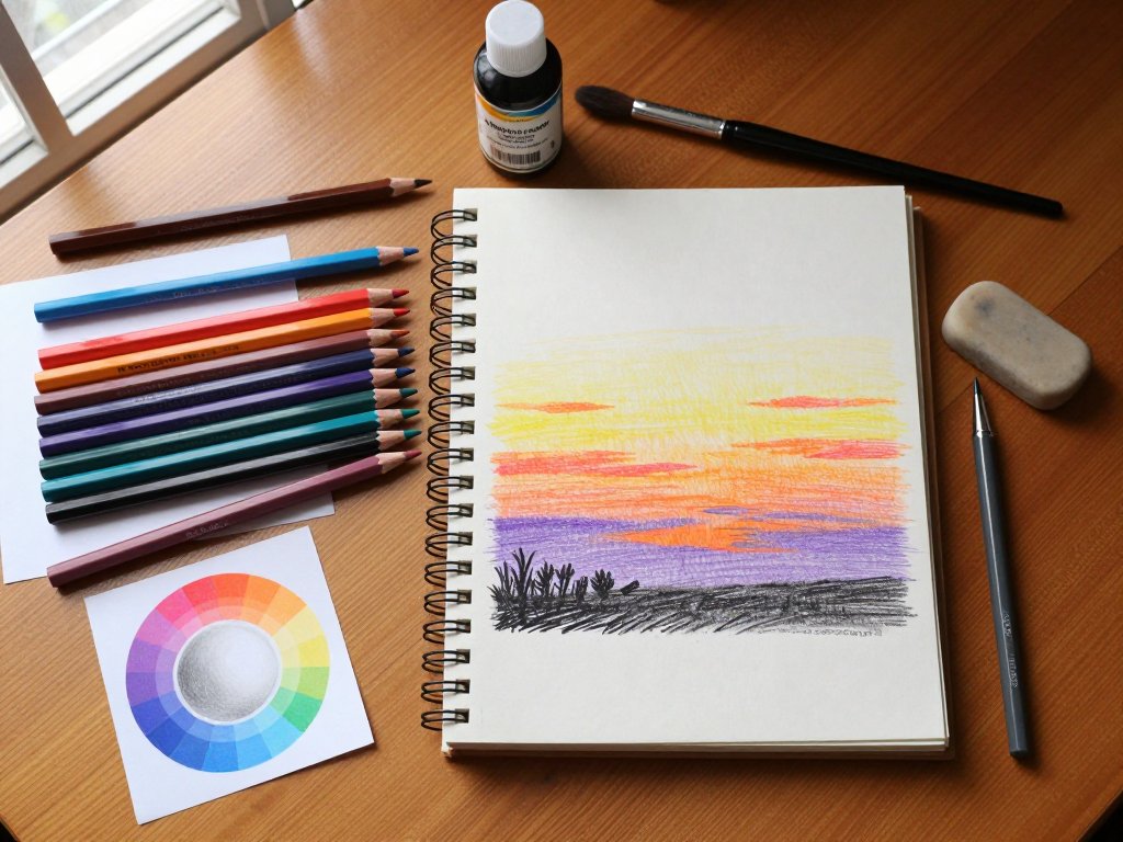
A Simple Project: Blended Sunset Sky
Let me walk you through a project that uses all the techniques we have covered. A sunset sky is the perfect subject for practicing blending because the colors transition naturally from one to the next, and there are no complicated shapes to worry about.
Step one: Lightly sketch a horizontal line about a third of the way down your paper. This is the horizon. Above it is the sky. Below it will be a simple landscape silhouette later.
Step two: With a light yellow pencil, shade the entire sky area from the horizon to the top of the page, using very light pressure. This establishes your base layer.
Step three: Switch to a light orange pencil. Start shading from the horizon upward, covering about the bottom third of the sky. Let your strokes feather into the yellow area so there is no hard line between the orange and yellow.
Step four: Add a light pink or coral pencil just above the orange, feathering it into both the orange below and the yellow above. You now have three colors overlapping in a gradient.
Step five: Take a light purple or lavender pencil and shade the very top of the sky, feathering downward into the yellow.
Purple and yellow are complements, so the transition area will produce a neutral gray that reads as atmospheric haze — exactly what real sunsets look like near the zenith.
Step six: Using the layered blending method from above, go back over the entire sky with very light pressure, using the lightest color in each zone to feather the boundaries. If you have odorless mineral spirits, a light pass with a damp brush will smooth everything beautifully.
Step seven: Add a dark silhouette along the horizon — trees, buildings, or hills — using a dark purple or navy pencil. The silhouette grounds the sky and makes the blending look intentional and polished.
This project takes about thirty minutes and produces a finished drawing that looks far more advanced than the simple techniques behind it. I have made dozens of these sunset studies, and every one teaches me something new about how colors interact.
Common Beginner Frustrations and How to Work Through Them
Blending and layering are simple in theory, but they can feel frustrating in practice. Here are the issues I ran into most often and how I fixed them.
The colors look grainy and patchy. This means you are not using enough layers. Most beginners stop at two or three layers when they need six or eight. The paper tooth is still visible through the pigment, creating the grain. Keep adding thin layers until the paper texture disappears.
The colors look muddy. Muddy color happens when you mix too many opposite colors, or when you blend a light pencil over a dark one without enough intermediate layers.
If your drawing looks muddy, check whether you skipped a middle value. Going from light blue straight to navy blue without medium blue in between will always look muddy because the transition is too abrupt.
The pencil strokes are visible. This is normal in the first few layers. Strokes become less visible as you add more layers and the paper tooth fills in.
If strokes are still visible after six layers, you may be pressing too hard. Lighter pressure produces softer edges that disappear into the layer below.
I cannot get the color dark enough. Some colored pencils max out at a medium value no matter how many layers you add.
This is common with student-grade pencils. If you need darker values, switch to a darker color rather than trying to force the same pencil.
A dark blue layered over medium blue will always produce a deeper result than pressing harder with the medium blue.
Building a Daily Practice Habit
The single best thing I did for my colored pencil skills was commit to a ten-minute practice session every evening. Not an hour. Not a full drawing. Just ten minutes of focused technique work after the kids were in bed and the house was quiet.
I keep a small sketchbook dedicated to blending practice. Each page has one or two small color swatches — a gradient from one color to another, a value scale in a single hue, a tiny sphere shaded with layering.
No pressure to make art. Just my hand learning how the pencils behave.
After two weeks of this routine, my blends were noticeably smoother. After a month, I could look at a photograph and see the layers of color underneath the surface, the way one value transitioned into the next.
That skill — seeing color in layers — is the real goal. The drawing is just the result.
Pick two colors from your set. Any two. Shade a small rectangle with one, then layer the second over part of it, then go back and forth between them until the transition looks smooth.
That is your practice for today. Tomorrow, pick two different colors. The day after, try three.
In a month, you will have a sketchbook full of color studies and a skill that transfers to every drawing you make.
A Gentle Closing Thought
The colored pencil set my grandmother gave me is long gone — the tin box rusted, the pencils worn down to stubs.
But the lesson it taught me has stayed: tools do not make the artist. Practice does.
A twelve-dollar set of basic pencils in the hands of someone who understands layering and blending will produce richer work than a two-hundred-dollar set in the hands of someone who has not yet learned to build color in thin passes.
Start with the pressure exercise. Then layer a sphere. Then blend a sunset. Each one builds on the last, and none of them require more than a handful of pencils and a quiet half-hour.
The grandmother who gave me that first set could not blend colored pencils herself — she was a watercolor painter through and through.
But she gave me the tools anyway, trusting that I would figure out what to do with them.
You have the tools now, too. What you do with them is up to you.