Introduction
I still remember the first time I painted on a piece of toned paper. It was a warm June afternoon, and I had brought a small sketchbook to a local park, hoping to capture the way the late sunlight filtered through the maple leaves.
My watercolors felt thin and washed out against the white pages, and I was growing frustrated.
Then a friend handed me a sheet of warm gray paper and a tiny set of gouache paints.
"Try this," she said. "It changes everything."
She was right. Something about the way gouache settled onto that softly colored surface felt like coming home to an art form I had not yet discovered.
The paint was opaque, creamy, forgiving. The paper did half the work for me, providing a built-in midtone that made every brushstroke feel deliberate and complete.
If you have ever felt intimidated by the precision of watercolor or frustrated by the permanence of acrylic, gouache on toned paper might be exactly the painting experience you have been searching for.
It is gentle, forgiving, and deeply satisfying — perfect for capturing the soft, hazy beauty of summer landscapes.
What Makes Gouache Special
Gouache (pronounced gwash) is often described as the bridge between watercolor and acrylic, but that description sells it short.
Gouache has a personality all its own. Like watercolor, it can be reactivated with water even after it dries, which means you can blend, soften, and adjust your work as you go.
Like acrylic, it is opaque — the light pigment sits on top of the paper rather than soaking in, giving you the ability to paint light over dark in a way that watercolor simply cannot.
This opacity is what makes gouache such a wonderful medium for beginners. Made a stroke too dark?
Let it dry, then paint over it with a lighter color. Want to add a highlight at the very end?
No need to carefully preserve white paper — just mix a bit of white gouache and paint it right on top.
When you pair gouache with toned paper, something magical happens. The paper's midtone gray, tan, or blue-gray becomes the foundation of your entire painting.
Your dark colors gain depth against it, your light colors glow, and you suddenly find yourself painting in three dimensions without having to work as hard to establish values.
The paper does the heavy lifting, and you get to focus on the joy of creating.
Choosing Your Toned Paper
Toned paper comes in a variety of colors, and each one creates a different mood for your landscape paintings. Here are the most common options and what they bring to your work:
Warm gray or tan paper is the most popular choice for landscape painting. Its warm undertones complement earthy greens, golden yellows, and soft browns — exactly the colors you will reach for when painting summer fields, sandy shores, and sun-drenched hillsides.
Strathmore's toned tan sketchbooks are widely available and a wonderful place to start.
Cool gray paper works beautifully for misty mornings, coastal scenes, and overcast skies. The cool undertone makes blues and grays sing, and it can give your landscapes a quiet, contemplative mood.
Blue-gray paper is a lovely choice for evening scenes and twilight landscapes. The subtle blue tone adds depth to shadows and makes warm sunset colors pop with surprising intensity.
For beginners, I recommend starting with a warm gray or tan paper. It is the most forgiving option and pairs naturally with the colors you will use most often in summer landscapes.
Look for paper that is at least 98 lb (160 gsm) so it can handle a bit of water without buckling.
A spiral-bound toned sketchbook is ideal — easy to carry, easy to flip, and ready whenever inspiration strikes.
Gathering Your Gouache Palette
You do not need a large collection of colors to paint beautiful summer landscapes on toned paper. A carefully chosen palette of five to eight colors will take you surprisingly far. Here is what I recommend for beginners:
White — Titanium white is essential for highlights, clouds, and mixing light values. You will use more white than any other color, so buy a large tube.
Yellow — A warm yellow like cadmium yellow or hansa yellow medium. This is your sunshine, your golden wheat fields, your summer wildflowers.
Blue — Ultramarine blue is a versatile, beautiful choice for skies, water, and shadows. Mix it with a touch of white for soft summer skies.
Red — A warm red like cadmium red medium. You will use it sparingly for flowers, rooftops, and sunset accents.
Green — Instead of buying a tube of green, I encourage you to mix your own from blue and yellow.
The greens you mix yourself will feel more natural and varied than anything from a tube.
For a basic summer landscape, mix ultramarine blue with cadmium yellow and adjust the ratio until it looks right to you.
Brown — Burnt sienna or raw umber gives you warm earth tones for tree trunks, paths, and foreground details.
Black — A small tube of ivory black is useful for the darkest shadows, but use it sparingly. Most of your dark values can be mixed from ultramarine blue and burnt sienna.
Brands like Himi, Arteza, and Mijello offer affordable gouache sets that are perfect for beginners. If you prefer to invest in higher-quality paint from the start, Holbein and Winsor & Newton are excellent choices — their gouache is creamy, highly pigmented, and a joy to work with.
Essential Brushes and Tools
Gouache is forgiving about brushes in a way that watercolor is not. You do not need expensive sable brushes — synthetic brushes work beautifully with gouache's creamy consistency. Here is a simple starter set:
- A flat brush (about half an inch wide) for washing in large areas of color and creating soft edges
- A round brush (size 6 or 8) for detail work, trees, and fine lines
- A small round brush (size 2 or 4) for tiny details like flower petals or distant birds
- A water jar, a palette (a simple white ceramic plate works wonderfully), and a soft cloth or paper towel for cleaning your brushes
That is really all you need. One of the many kindnesses of gouache is its simplicity — you can pack your entire setup in a small bag and paint anywhere.
Understanding Value on Toned Paper
The single most important concept to understand when painting on toned paper is value — how light or dark a color is. On white paper, every color you paint looks darker by comparison. On toned paper, the paper itself becomes your midtone reference point.
Think of it this way: your toned paper is value five on a scale of one to ten, with one being pure white and ten being pure black.
Anything lighter than the paper is a highlight (values one through four). Anything darker is a shadow (values six through ten).
Your job as a painter is simply to decide which parts of the scene are lighter than the paper and which are darker, and paint accordingly.
This built-in reference makes gouache on toned paper extraordinarily beginner-friendly. You are not staring at a blank white page wondering where to begin. The paper itself gives you a starting point, and every decision you make builds on that foundation.
Technique: Painting Soft Summer Clouds
Let us practice with one of the most satisfying subjects for gouache on toned paper: soft summer clouds drifting across a warm sky.
Start by mixing a small puddle of pale blue — ultramarine with plenty of white, thinned with just a drop of water to a creamy consistency.
Using your flat brush, paint a loose wash across the upper third of your paper.
Do not worry about making it even. Uneven washes create natural cloud shapes.
While the blue is still damp, dip your brush into pure titanium white. Lightly touch it to the paper in soft, rounded shapes.
The white will bloom into the blue, creating fluffy, ethereal clouds with soft edges. If the white picks up too much blue, rinse your brush, pat it dry, and try again with thicker paint.
The opacity of gouache means you can layer white over blue even after the first layer dries.
Add a touch of warm yellow to the white for clouds catching the evening sun. Dab it gently near the horizon line. Step back and look at what you have created — soft, luminous clouds floating in a summer sky, and you painted them in minutes.
Technique: Layering a Summer Landscape
One of the great joys of gouache is the ability to paint from background to foreground, layering your way forward through the landscape. Here is a simple approach:
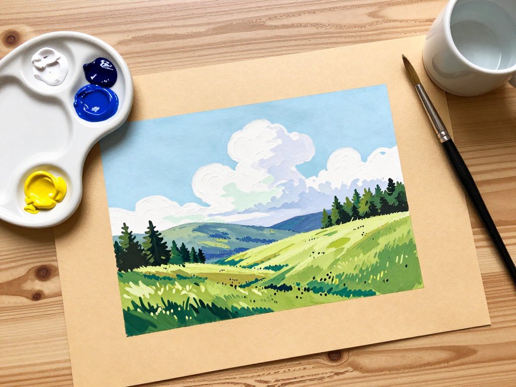
Step 1 — The sky. Paint your sky as described above. Let it dry completely — gouache dries quickly, usually within a few minutes.
Step 2 — Distant hills. Mix a pale, hazy blue-green. Using your flat brush, paint the distant hills as soft, simplified shapes. Keep the edges soft by blending with a slightly damp brush. These distant shapes should feel quiet and atmospheric.
Step 3 — Midground trees. Mix a slightly darker green — more blue than yellow, with a touch of burnt sienna to warm it.
Paint tree shapes with your round brush, using short, vertical strokes for pine trees or rounded shapes for deciduous trees.
Keep these shapes simpler than you think they should be. Gouache rewards confidence, not fussing.
Step 4 — Foreground. This is where you can add detail and texture. Mix warm greens, golden yellows, and earthy browns.
Paint the grass in varied strokes — some short, some long, some light, some dark.
Add a few flowers with small dots of red or white. Let yourself enjoy this part.
The foreground is where your painting comes to life.
Step 5 — Highlights. With pure white or very light warm yellow, add final highlights: sunlit edges of clouds, the bright side of a tree trunk, wildflowers catching the light. These small touches of pure light are what make a painting feel finished and luminous.
Common Beginner Questions
Can I use watercolor paper instead of toned paper? You can, but the experience will be different.
White watercolor paper requires you to establish every value from scratch, while toned paper gives you a head start.
If you want to try toned paper without buying a dedicated sketchbook, you can tone white watercolor paper yourself with a thin wash of dilute brown or gray gouache.
Let it dry, and you have homemade toned paper.
How much water should I use? Gouache should have the consistency of heavy cream — fluid enough to spread easily but thick enough to be opaque. If your paint is translucent like watercolor, you have added too much water. Add more paint to thicken it up.
Why is my gouache cracking as it dries? Cracking happens when gouache is applied too thickly, especially in multiple layers.
If you notice cracking, try using less paint per layer and allowing each layer to dry fully before adding the next.
A tiny drop of gouache medium or honey mixed into your paint can also help prevent cracking.
Can I erase mistakes? One of gouache's greatest gifts is its forgiveness. If you make a stroke you do not like, let it dry, then paint over it.
Because gouache is opaque, the mistake disappears completely. You can even rewet dried gouache and lift it away with a damp brush, though this works best on paper that is not too absorbent.
Embracing the Imperfect
There is a reason so many painters describe gouache as a gentle medium. It does not demand perfection.
A brushstroke that is not quite where you intended can become a happy accident — a unexpected shadow, a tree branch you had not planned, a cloud that took on a life of its own.
Some of the most beautiful paintings I have made on toned paper started with what I thought were mistakes.
If you are new to gouache, give yourself permission to make a few imperfect paintings.
Paint the same scene twice — once to learn, once to enjoy. Notice how the toned paper changes the way you see color and light.
Let the process be as soothing as the subjects you choose to paint.
Conclusion
Gouache on toned paper is one of those rare creative experiences that feels like a secret waiting to be shared.
It is accessible enough for a complete beginner yet rich enough to grow with you as your skills develop.
The soft, luminous quality of the paintings it produces — particularly in summer landscapes — has a way of capturing not just what a scene looks like, but how it feels to be there on a warm afternoon.
Next time you have an hour to yourself, pour a cup of tea, pull out a sheet of toned paper, and mix a little blue and white on your palette.
You might be surprised at what emerges — not just a painting, but a quiet moment of creativity that belongs entirely to you.