Introduction
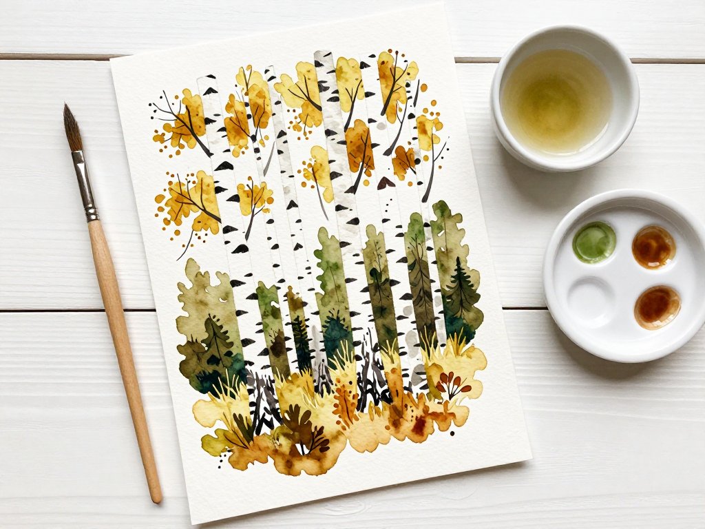
The house is finally quiet. Your tea has gone lukewarm, and there is a sheet of watercolor paper on the table you are slightly afraid to ruin. Birch trees are a good place to begin on an afternoon like that.
They ask for very little. A white trunk, a handful of dark marks, a pale wash of green behind them, and suddenly there is a small wood on your page. Nothing has to be perfect for it to work.
This guide walks you through the painting in the order I teach it to friends: sketch, mask, wash, darks, bark marks, branches, ground. You can finish a study in one sitting, or leave it and come back after bedtime.
If you have painted before and it went badly, that is useful information, not a verdict. Most first watercolors fail for a few small, fixable reasons, and we will name them plainly near the end.
Why Birch Trees Are Kind to Beginners
Birch has three gifts for a beginner, and they are worth understanding before you pick up a brush.
The first is white. On white paper you are not trying to paint a trunk, you are trying to protect one. That is a much easier job, and it teaches the habit behind every watercolor you will ever make: save your light, paint your dark.
The second is contrast. A white trunk against a soft green forest is one of the strongest value contrasts in nature. Even a timid wash looks convincing, because the white does the dramatic work for you.
The third is forgiveness. Birches lean, bend, fork low, and lose branches. A wobbly silhouette reads as character rather than error, which is not true of, say, a lighthouse.
Together, those three things mean a first attempt can look like a painting rather than an exercise. On day one, that matters more than technique.
The Materials That Matter
You do not need much, and you probably own half of it already.
Paper
Use cold-press watercolor paper at 140 lb, or 300 gsm. Cold press has a slight tooth that holds soft edges beautifully and hides small hesitations. Hot press is smoother and far less forgiving of a heavy hand.
140 lb is the right weight for most people because it takes a wet wash without buckling and does not need stretching. Lighter paper cockles; heavier paper is lovely but expensive for practice.
A 9 by 12 inch block, or a few loose quarter sheets, is plenty. For your first study, work no larger than your patience.
Brushes
Two brushes carry this whole painting: a round brush around size 8 or 10, and a flat brush about an inch wide. The round makes trunks, branches, and marks. The flat lays the sky and forest wash.
A hake brush is a lovely upgrade if you have one. It holds a wide bead of water and lays a wash in two or three strokes instead of eight, which is exactly what you want when you are trying not to overwork.
Keep an old, cheap brush aside for masking fluid. It will be ruined, and that is normal. A silicone colour shaper also works and never suffers.
Water, towel, and something white
Two jars of water, one for rinsing and one for clean mixing. A folded paper towel or linen rag to lift colour and test values. A board you can tilt a little.
Then the choice that shapes the whole painting: masking fluid, or opaque white gouache.
Masking fluid is liquid rubber. You paint it on dry paper where the trunks will be, let it cure, paint freely over it, then rub it away. The white underneath is untouched, bright, and full of texture.
It gives you the crispest trunks and lets you be bold with darks. The trade-offs are real: it can tear soft paper, it ruins brushes, it smells, and it must be completely dry before you paint near it.
Opaque white gouache goes on at the end, over dried paint. You simply paint white trunks on top of your forest. Nothing is masked, nothing is at risk, and mistakes can be corrected.
The cost is texture. Gouache sits on the surface and can look chalky beside transparent watercolor, and it hides the paper grain that makes birch bark feel like birch bark.
My honest advice: use masking fluid for a study you want to keep, and gouache when you are painting with children nearby or short on patience. Both are legitimate. Neither is cheating.
A short palette that does the heavy lifting
Five colours and one grey will see you through. This is a palette that mixes cleanly and rarely turns to mud by accident.
- Yellow ochre — warmth in autumn grass, and a softener for harsh greens.
- Burnt sienna — the warm brown in bark marks and bare twigs.
- Sap green or olive — the body of the forest, especially in summer.
- Ultramarine — distance, shadow, and the cool side of everything.
- A neutral grey — Payne's grey, or a mixed grey of ultramarine and burnt sienna.
Payne's grey is convenient but slightly blue, and it can deaden a warm scene. A mixed grey feels more alive because you control its temperature. Try both and notice which one you reach for.
Three mixes do most of the work. Distant forest: ultramarine, a touch of yellow ochre, and a lot of water. Mid-ground green: sap green with a little burnt sienna, then a hint of ultramarine to cool it.
Bark marks: burnt sienna and ultramarine, mixed to a dark warm brown-grey. Never black. Black flattens everything around it and looks like ink rather than bark.
Keep your mixing wells shallow and your puddles generous. A stingy puddle dries before you finish a single trunk.
Sketching Trunks That Look Like They Grew
Sketch lightly with a 2B pencil, or paint the shapes directly in pale grey. Either way, decide the composition before any colour arrives.
Place three to five trunks. One large trunk in the foreground, a middle one slightly thinner and further back, and two or three small ones near the tree line. Odd numbers feel natural.
Taper every trunk. Birch is widest at the base and narrows steadily toward the top, sometimes dramatically. Draw two converging lines rather than one even column, and the tree instantly looks grown rather than built.
Lean them. Almost no birch stands perfectly vertical. A lean of two to five degrees, in slightly different directions, is the difference between a wood and a fence.
Change the spacing. Even gaps read as pattern. Put two trunks close enough to almost touch, then leave a generous gap before the next one.
Never draw trunks perfectly parallel. Parallel lines tell the eye these are posts. Converging, slightly tilted lines tell the eye these are trees reaching for the same light.
Keep the tops at different heights, and let one trunk run off the top edge. Trees that all end neatly inside the paper look like a diagram.
Mark the ground line as a shallow curve, not a ruler line. A slight rise to one side gives the eye somewhere to stand.
Masking the Trunks and Letting Them Dry
If you are using fluid, apply it now, on bone-dry paper, with an old brush or a colour shaper. Paint the full trunk shape, including where the main branches will leave the trunk.
Soap the brush first, or dip it in a little washing-up liquid and wipe it off. This stops the rubber grabbing the bristles. Work quickly, and do not go back over a half-dry line, which drags the film.
Keep the edges slightly irregular. A perfectly smooth masked edge looks like a sticker. Small wobbles and a narrow taper at the top read as bark.
Mask less than you think. You need the lit side; the shadow side will be painted later. Leaving a thin strip unmasked on the shadow side saves you from a flat white pole.
Then let it dry completely. Not mostly. Not nearly. Completely. Ten to fifteen minutes in a warm room, or a hairdryer on cool, held well back.
If you paint a wet wash over tacky fluid, you will glue the film to your brush and lift half the mask. This is the most common way a good birch study is lost.
If you are using gouache instead, skip this step, but leave the trunk shapes as bare paper for now and treat them as reserved white. If you want a wider look at resists, my guide to watercolor resist techniques covers wax, tape, and fluid side by side.
The Background Wash: Pale, Cool, and Soft-Edged
Wet the paper first. Use clean water and your flat or hake brush, and touch the surface lightly, without scrubbing. You are dampening the tooth, not flooding the sheet.
Work around the foreground trunk and let the wash run right up to the masked edge, which will later become a soft halo. Masked trunks resist water anyway, so you can be relaxed here.
Mix a pale cool green: ultramarine, a touch of yellow ochre, a whisper of sap green. It should look almost too weak on the palette. Distant trees are always paler than we expect.
Tilt the board slightly and lay the wash in three or four long strokes, top to bottom, reloading once. Do not go back into a stroke that is already setting.
While it is still damp, drop in a few stronger touches of the same green along the lower tree line, and a little clean water near the top edge. Let them find each other.
Keep the colour pale and cool. If it starts to look like a summer hedge, add water, not paint. You can always deepen a wash later; you cannot lighten it.
Leave soft edges where the forest fades into sky or mist. A hard edge belongs only where one mass of trees meets another. Everywhere else, let it blur.
Then walk away. Let it dry flat and completely before the next layer. This is the hardest instruction in watercolor and the one that saves the most paintings.
Mid-Ground and the Darks Behind the Trunks
Now the forest behind the trunks gets its body. Mix a mid green from sap green, burnt sienna, and a touch of ultramarine, at a value clearly darker than your first wash.
Paint the negative space: the shapes between and behind the trunks, not the trunks themselves. Your brush traces the gaps, and the white trunks emerge as the paint goes around them.
Place your darkest darks directly behind the lit side of each trunk. This is the whole trick. Contrast is local, so the strongest dark must sit next to the whitest white.
Add a few soft trunks in the middle distance, painted in pale grey-green rather than masked. They sit behind the heroes and make the forest feel deeper than three trees.
Vary your edges here. Some foliage masses need a crisp edge where they meet open sky; others should dissolve. Uniform edges make a painting look like wallpaper.
Deepen selectively, in small patches, and let each patch dry before judging it. Wet watercolor always looks stronger than dry, and it is easy to overshoot.
Removing the Mask and Painting Bark Marks
Let everything be bone dry, then remove the masking fluid. Rub gently with a clean fingertip or a soft eraser, working from the edge inward. Never pull.
Look at what you have: bright reserved trunks against a soft green forest. Resist the urge to fill them. At least half of each trunk should stay untouched white.
Mix bark marks from burnt sienna and ultramarine into a dark warm grey-brown. Test it on scrap paper. It should be strong enough to read from several feet away.
Use the tip of your round brush and make short horizontal dashes, two to four millimetres long. Vary the length, the pressure, and the gap between them.
Work on the shadow side only. Paint that side first as a thin vertical glaze of cool grey, then let the dashes sit inside it. That single habit makes trunks turn.
Group your marks. Real birch has clusters, scars, and long empty stretches. Spreading marks evenly across the whole trunk is the fastest way to make it look printed rather than painted.
Make marks larger and denser near the base, smaller and sparser toward the top. Bark behaves this way, and the eye reads it as weight.
Add a few flecks and short angled ticks, plus one or two longer scars where a branch has gone. A handful of marks painted into a barely damp patch will blur and look older.
Branches, Twigs, and the Fine Hanging Lines
Birch branches leave the trunk at a narrow upward angle, then arch outward. Paint them with the fine tip of your round brush, or a rigger if you own one.
Start at the trunk and pull outward and upward in one breath. Lift the brush as you go, so the line tapers to nothing. A branch of even thickness looks like wire.
Give each branch a slight elbow. Straight branches look mechanical; a small change of direction reads as growth.
Then the hanging twigs. Birch is known for fine, drooping threads at the ends of its branches, and they are what makes a birch look like a birch rather than a poplar.
Use a pale purple-grey, ultramarine with a touch of burnt sienna, and paint them thin and slightly curved, falling from the branch tips. Fewer than you think — six or seven per tree.
Keep them light. Hanging twigs are usually seen against sky or pale forest, so they should stay delicate. Heavy dark twigs turn a graceful tree into a willow.
Ground, Cast Shadows, and Five Common Fixes
Anchor the trees before you finish. A trunk that meets the ground with no shadow looks pasted onto the paper.
Paint a soft cast shadow at the base of each trunk, angled consistently: all to the left, or all to the right. Decide the light once and keep it.
Mix the shadow cool — ultramarine, a little burnt sienna, plenty of water. Shadows on grass are violet-grey, not black, and never the same green as the grass.
Use a small ellipse at the base, then pull the shadow away from the trunk and let it fade. Lift a little colour with a dry brush at the far end so it dissolves.
Add a few grass strokes and broken ground marks in a slightly warmer green. Stop early. Ground detail steals attention from the trunks.
Five common problems, and the fix
- Mud. Too many colours, too many passes, dirty water. Fix: rinse between mixes, limit each mix to two pigments, and let layers dry.
- Muddy greys. Grey mixed from everything at once. Fix: build it from ultramarine and burnt sienna, then push it deliberately cooler or warmer.
- Blooms and blossoms. Water dropped into a drying wash. Fix: wait until fully dry, or rewet the whole area evenly before adding paint. Never dab at a half-dry wash.
- Trunks like poles. No taper, no lean, even width, parallel lines. Fix: converging lines, two to five degrees of lean, and one trunk allowed to run off the page.
- Marks too even. Identical spacing, size, and direction. Fix: group them, skip spaces, vary lengths. Bark is a rhythm, not a pattern.
A Last Look, and a Second Study
Stand back and squint. If the white trunks read clearly against a soft green wood, the painting has done its job, even if a branch wandered and one shadow sits a little heavy.
Beginners tend to judge a watercolor by its accidents. Try judging it by whether it feels like a place. That is the only standard that matters for a first study.
For your second painting, change one thing: a dusk sky of pale ochre and rose behind the trunks, or a single close-up trunk filling the page, with bark marks large enough to see clearly.
Leave the first one on the table where you can see it while the kettle boils. It will teach you more than another tutorial ever could, because it is yours.