Introduction
There is a particular hour in winter when the light goes soft and the snow turns the colour of old linen. My grandmother's porch faced a stand of spruce, and I spent whole evenings watching that view go blue, then grey, then almost black.
This project is my attempt to keep one of those evenings on a small board. You will paint a winter landscape in acrylics, start to finish, in a single sitting. No experience needed, and nothing in it has to be exact.
The scene is deliberately simple: a low horizon, a wide sky, a far treeline, and two or three evergreens standing close together. Simple shapes give you room to breathe while you paint them.
Set out a cup of tea, put on something without words, and give yourself the evening. That is the whole preparation for the mood, and it matters more than the brushes.
A Palette That Fits in One Hand
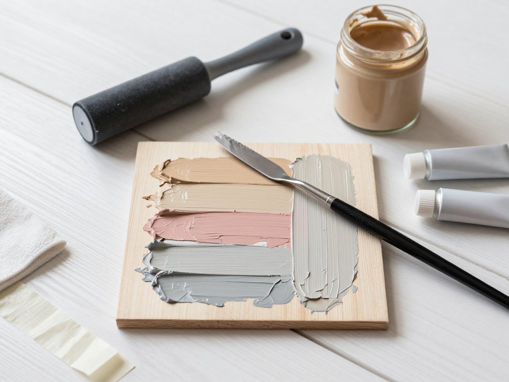
Winter is the most forgiving season to paint because it asks for so little. Snow is not one colour, but the colours it borrows are few. Four tubes will carry this entire scene.
Titanium white does the heavy work, and you will use more of it than feels reasonable. Ultramarine or cobalt blue gives you the sky, the shadows and the cool distance. Burnt sienna warms the trunks and keeps the greens from turning plastic.
A touch of yellow ochre softens the white where the light lands, so the snow reads as lit rather than iced. That is the full set. Four colours, one wide brush for sky, one smaller brush for trees.
Fewer colours make a painting feel like a single weather system rather than a collection of separate objects. Every mix you make descends from the same family, which is why the finished scene holds together.
Most of your mixing happens on the brush, not on the palette. Pick up white first, then dip the very tip into blue, and stir as you paint. That is how you get a sky that shifts instead of a flat slab of colour.
If you have ever stood at a window and thought the snow looked faintly pink at dusk, you already understand why the ochre earns its place.
Look at the four tubes for a moment. Which one would you reach for first, and what does that tell you about the winter light you remember best?
Choosing a Surface and Getting It Ready
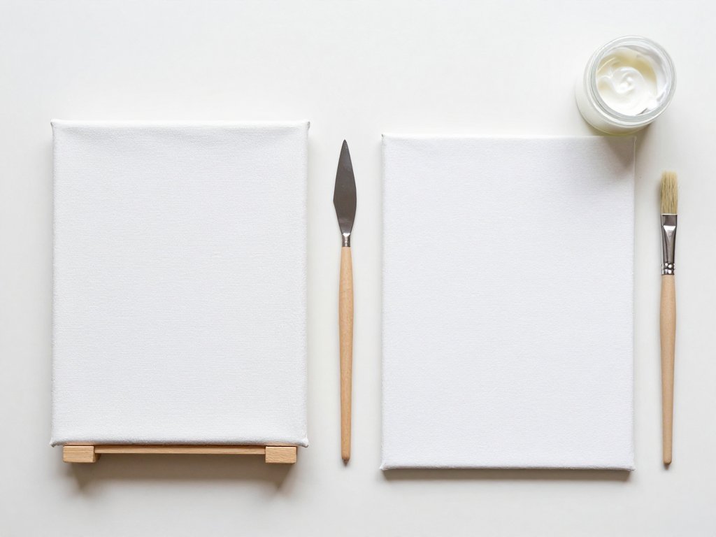
A canvas panel is rigid and inexpensive, which suits a first snow scene, while a stretched canvas gives a little under the brush and feels more like a finished piece. Choose whichever you already have, because the technique is identical on both.
If your surface is bright white, wipe a thin wash of diluted burnt sienna across it and let it dry. The warm ground stops you judging your whites against a glaring page.
If you would rather keep the white, run low-tack tape around the edges and paint to the tape line. Either approach works. Toning is simply kinder to the eye in the first ten minutes.
Keep the board flat on a table rather than propped on an easel. Wet acrylic sky bands run, and gravity is not your friend when you are blending downward.
Composing a Low-Horizon Winter Scene
Place the horizon about a third of the way up the surface, or even lower. Winter skies are enormous, and giving the sky most of the space is what makes the scene feel cold and open.
Mark three things lightly in pencil: the horizon line, a distant treeline just above it, and the position of your near evergreens. Keep the near trees off centre, perhaps a third in from one edge.
Leave a clear gap of snow between the far treeline and the near trees. That gap is the middle distance, and it is where the painting will find its depth.
A low horizon also gives your snow field somewhere to go. The eye travels from the bottom edge, across the open white, and up into the trees without ever feeling crowded.
Where would you put your near trees, left or right of centre? There is no wrong answer, only a choice about which side of the sky you want left open.
Before you load a brush, decide where the light is coming from. Choose one direction and stay loyal to it for the whole evening. Consistency of light does more for a beginner painting than any amount of detail.
Laying In a Graded Winter Sky
Mix a pale blue-grey: mostly white, a little ultramarine, the smallest touch of burnt sienna to take the chill off. Load a wide flat brush and lay a band across the top of the board.
Work downward while the paint is still wet, adding a little more white to the brush for each band. The sky should move from deeper blue overhead to almost white at the horizon.
Use long horizontal strokes and keep them overlapping. Short dabs read as clouds. Long sweeps read as weather, which is what you want behind bare trees.
If a hard stripe appears, drag a clean damp brush across the seam while the paint is still open. Acrylics forgive this for about a minute, so work with a little confidence rather than caution.
Near the horizon, leave the colour milky. Distant air sits between you and everything far away, and it washes colour out of whatever it touches.
Keep the whole sky slightly cooler than feels comfortable. Warmth in a winter sky reads as summer haze, and the scene loses its edge.
Step back and look at the sky upside down, or in a mirror if you have one nearby. Fresh eyes catch a lopsided gradient faster than tired ones.
A Distant Treeline and the Haze Between
Mix a grey-violet from white, ultramarine and a whisper of sienna. It should look weaker than you expect, closer to the colour of a shadow on snow than to anything green.
Paint the far treeline as a soft uneven band just above the horizon. Use the tip of your brush and let the tops break into small bumps rather than a tidy sawtooth.
Do not paint individual trees at this stage. At that distance a forest is a texture, not a row of shapes, and your eye fills in the rest.
While the band is still damp, soften its lower edge with a clean brush so it sinks into the snow field. That blur is the haze, and it does more for depth than any amount of careful drawing.
If the treeline looks too dark, lift a little paint with a damp cloth and add white to what remains. Distance is pale, always, even on the coldest clear day.
Painting Evergreens with a Flat or Filbert
For the near trees, mix a dark green from ultramarine and yellow ochre, then knock it back with a touch of burnt sienna. Straight green will look like plastic holly against all that white.
Load a flat or filbert brush and start at the top of the tree. Press the bristles down, drag slightly sideways, and lift. That single motion gives you a branch with a soft outer edge.
Work down the tree in overlapping layers, making each tier a little wider than the one above it. Vary the pressure: firm near the trunk, feather-light at the tips.
Leave gaps. Real evergreens are full of holes, and those gaps will let sky and snow show through later, which is what keeps a painted tree from looking like a cut-out.
Add a second, lighter green on the side facing the light. Two greens are enough to make a tree turn in space; a third is rarely necessary.
Paint the trunk last, with a thin line of burnt sienna mixed with blue. It should be barely visible, mostly a dark suggestion running between the branches.
Give each tree a different silhouette. One narrow and tall, one broad and a little hunched, one small and half hidden behind another. Three copies of the same shape read as wallpaper.
Snow Resting on Branches
Now the part that makes a winter tree look like a winter tree. Load a small brush with thick, undiluted white and touch it to the top edge of each branch tier.
Do not outline the branches. Place a soft mound of white where snow would naturally settle, and let a little of it hang over the edge here and there.
Vary the amount. Some tiers hold a heavy cap, others only a dusting, and one or two stay bare. That irregularity is what your eye recognises as real.
If the white looks chalky against the green, add the tiniest amount of blue to the mix. Snow in shade is never pure white, and a hint of blue ties it to the sky.
Snow Fields and the Colour of Shadow
Snow is a mirror. It has almost no colour of its own, so it shows you the sky, the trees and the low sun instead. That is why snow shadows are blue-violet and never grey or black.
Paint the open field with white, then mix a shadow colour from white, ultramarine and a little violet or sienna. Keep it pale and slightly purple, more suggestion than statement.
Lay the shadows in long soft shapes that follow the ground. Around the base of each tree, add a cool patch that stretches away from your chosen light.
Use grey and the snow goes dead. Use black and it looks like dirt tracked in from the road. Blue-violet keeps the surface looking cold, reflective and alive.
Leave the brightest snow untouched. The white of the panel itself, or your cleanest white, is the light, and every other value exists to support it.
If your shadows feel too strong, glaze over them with a little white while they are still wet. Winter light is diffuse, so the edges of a shadow should be gentle.
Dry-Brush Texture for Drifts
Once the field is dry to the touch, load a dry brush with a small amount of white and drag it lightly across the surface. The paint catches only the tops of the texture, and that is a drift.
Follow the shape of the land. Long curves near the horizon, tighter strokes in the foreground where the ground rolls and dips.
Keep the brush almost empty. If paint goes down in a solid line, you have too much on the bristles, so wipe it and start again with less.
A few horizontal strokes dragged across the snow also suggest wind. Winter ground is rarely smooth, and a little unevenness makes it feel walked on.
Small Finishing Touches and Drying Time
Let the painting rest for a few minutes before you touch it again. Most of the finishing work is subtraction rather than addition, and it is easy to overdo.
Deepen one or two shadow shapes near the trees so the light has something to argue with. Add a hint of warm ochre in the sky just above the horizon, where the sun has been.
Scatter three or four tiny flecks of white across the sky for falling snow, no more. A few marks read as weather. Many read as a rash.
If you want a path, a fence line or a single distant post, add it now with a thin brush and a pale shadow rather than a dark line.
Acrylics are touch-dry in well under an hour and safe to handle overnight. Give the surface a full day before you frame it, stack it or wrap it for a gift.
When Something Looks Off
Three things usually go wrong with a first snow scene, and all three are fixable.
Muddy snow. This happens when white is stirred into a wet dark mix. Let the layer dry, then lay fresh white over the top rather than trying to lighten what is already there.
A banded sky. Hard stripes come from painting over a band that has already dried. Rewet the whole sky area with a damp brush, then blend while it is open, or soften each seam as you work downward.
Flat-looking trees. A tree goes flat when every tier is the same width and the same value. Add one lighter green on the lit side, one darker note underneath, and a few gaps to break the silhouette.
None of these mean you have failed. They are the ordinary corrections of a first attempt, and nearly every painter makes all three in the same evening.
What to Do With the Finished Painting
A small panel looks surprisingly good in a plain frame with a wide mat, or simply propped on a shelf against the wall.
If you paint it as a gift, write the date and the weather on the back. In ten years that note will mean more to someone than the image does.
A winter scene also works as a card front, cut down and mounted on folded card, or as a small piece for a hallway that never gets much daylight.
If it is your first, keep it. The paintings you make before you know what you are doing have a directness that is very hard to recover later.
Conclusion
You have painted weather rather than an object, and that is a quiet accomplishment. The sky does most of the work, the trees hold the foreground, and the snow carries the light.
If the result is imperfect, good. A slightly crooked evergreen or a shadow in the wrong place is what makes it yours rather than a copy of a photograph.
If you would like to practise layered landscape shapes before adding snow, the guide to layered watercolor landscapes walks through the same back-to-front order.
What would you change on a second attempt, the sky or the trees? Whichever you name is probably the part worth practising next.
Next time, try the same scene at dusk, with more violet in the sky and the trees almost black. Winter has more than one evening in it.