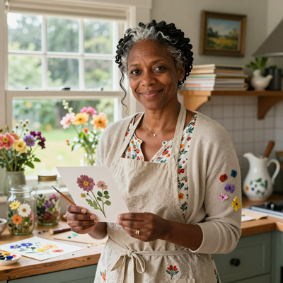
Introduction
Have you ever stood in the paint aisle, overwhelmed by the wall of colors, and wondered where to even begin?
Or finished a painting only to feel that something about the colors was just a little off?
You are not alone. Every painter, whether you work in watercolor, acrylic, or oil, has faced the moment when color choices feel like a guessing game.
The good news is that color does not have to be a mystery. Color theory is not a set of rigid rules you must follow.
Think of it more like a friendly guide that helps you understand why certain colors look stunning together and why others clash.
Once you learn the basics, you will feel more confident mixing paint, choosing palettes, and creating work that feels intentional and beautiful.
This guide walks you through everything you need to know about color theory as a painter. We will keep it simple, practical, and focused on what actually helps you at the easel.
What Is Color Theory and Why Should You Care?
Color theory is the study of how colors interact with each other. It goes back centuries, with early ideas from Aristotle and later advancements by artists like Leonardo da Vinci and Johannes Itten.
But you do not need to memorize history to benefit from it. At its heart, color theory answers three practical questions.
Which colors look good together? How do I mix the color I see in my reference photo? How do I create mood and depth with color alone?
Once you understand the answers, your paintings will look more cohesive. You will waste less paint on muddy mixes. And you will stop second-guessing your color choices halfway through a project. That alone is worth the time it takes to learn the basics.
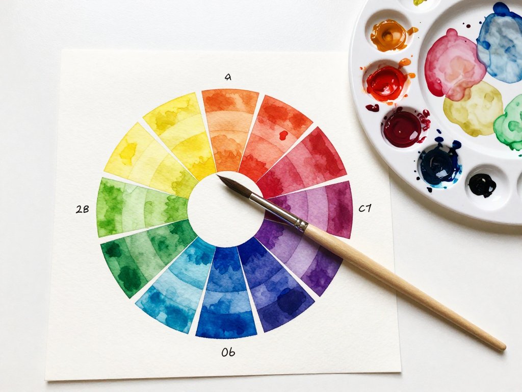
The Color Wheel: Your Best Friend
You probably remember the color wheel from elementary school art class. It is worth giving it another look, because it is genuinely useful.
The standard color wheel has twelve colors arranged in a circle. It starts with three primary colors: red, blue, and yellow. These are called primary because you cannot mix them from other colors. Every other color on the wheel comes from these three.
Between the primaries sit the secondary colors. Mix red and blue and you get purple. Blue and yellow make green. Yellow and red make orange. These three secondary colors fill the gaps between the primaries on the wheel.
The remaining six slots are tertiary colors. These are made by mixing a primary with a neighboring secondary. Red-orange, yellow-orange, yellow-green, blue-green, blue-purple, and red-purple. Together, the twelve colors form the complete color wheel that artists use every day.
If you do not already own a color wheel, pick one up at any art supply store or online. They cost about five dollars and are worth every penny. Keep it near your workspace. Referring to it will become second nature faster than you think.
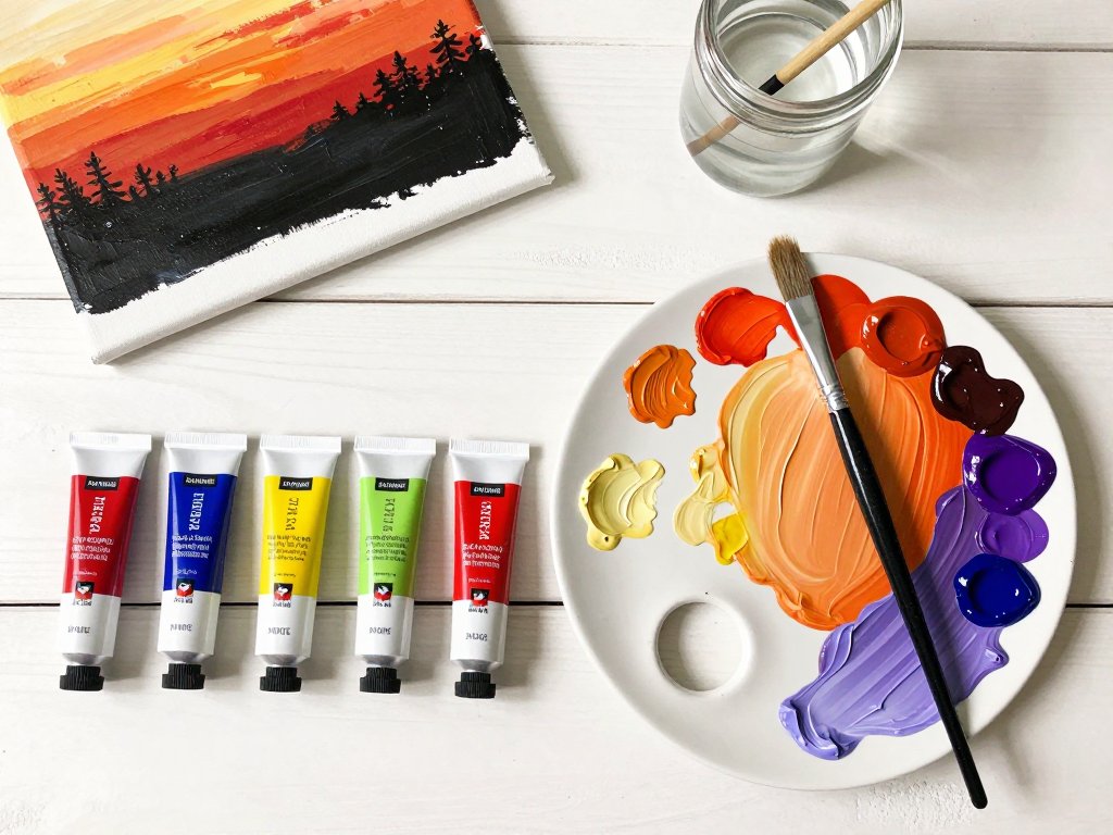
Warm Colors and Cool Colors
One of the most useful ideas in color theory is the division of colors into warm and cool families. This simple split helps you control the mood and depth of your paintings.
Warm colors include reds, oranges, and yellows. They feel energetic, inviting, and lively. They advance in a composition, which means they seem to come forward on the canvas. If you want something to stand out, use a warm color.
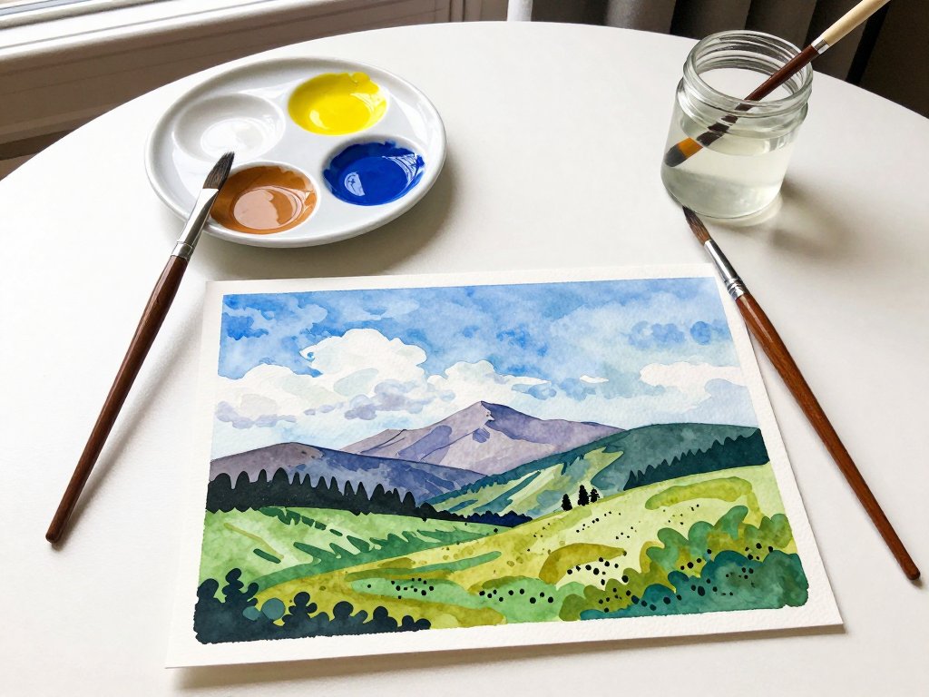
Cool colors include blues, greens, and purples. They feel calm, distant, and soothing. They recede in a composition, creating the illusion of space and depth. This is why distant mountains in a landscape look blue or purple.
Here is where it gets interesting. Every color has a temperature bias. A red can lean warm (think tomato red) or cool (think crimson with a hint of blue).
Being aware of temperature bias helps you mix cleaner colors. If you try to mix a vibrant purple from a warm red and a warm blue, you will get a muddy brown because the yellow undertones in both colors cancel out the purple.
Use a cool red with a cool blue, and your purple will sing.
Try this exercise: Look at your paint set and sort each color into warm or cool. Notice the subtle differences. A cerulean blue is cooler than an ultramarine blue. A lemon yellow is cooler than a cadmium yellow. Developing this awareness will improve your mixes immediately.
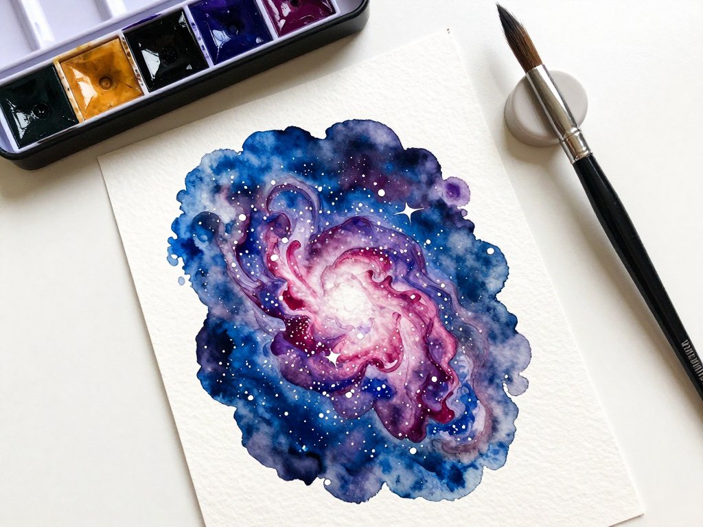
Color Harmony: Palettes That Work
Color harmony describes combinations of colors that are pleasing to the eye. These are not arbitrary rules. They are based on the natural relationships between colors on the wheel. Here are the most useful harmonies for painters.
Complementary colors sit opposite each other on the color wheel. Red and green, blue and orange, yellow and purple.
When placed side by side, complementary colors create the strongest contrast and make each other look brighter.
This is why a touch of red in a green landscape draws the eye. When mixed together, complementary colors make beautiful neutral grays and browns.
Analogous colors sit next to each other on the wheel. Blue, blue-green, and green form a peaceful analogous palette.
Yellow, yellow-orange, and orange create a warm, sunny feel. Analogous palettes are naturally harmonious and hard to get wrong.
They are perfect for beginners who want a cohesive look without complicated mixing.
Triadic colors are three colors evenly spaced on the wheel. The primary triad is red, blue, and yellow. The secondary triad is orange, green, and purple. Triadic palettes are vibrant and playful. Use one color as the dominant hue and the other two as accents for the best results.
Split-complementary is a variation of the complementary scheme. Instead of using the direct opposite, you use the two colors on either side of the complement. This gives you strong contrast without the intensity of a direct complement. It is a favorite among landscape painters for creating natural-looking scenes.
When you sit down to paint, try limiting your palette to two or three colors plus white. This constraint actually frees you from decision fatigue and creates more cohesive work. Many professional painters use just three colors for an entire painting.
Value: The Secret Ingredient
Color gets all the attention, but value is what makes a painting work. Value refers to how light or dark a color is.
A painting can have beautiful colors but look flat if the values are wrong. On the flip side, a painting with good values works even in black and white.
Here is a simple way to test this. Take a photo of your painting in progress and convert it to grayscale on your phone.
Do the dark areas feel dark enough? Are the light areas bright? If everything looks like a similar gray, you need to push your values further apart.
A good rule of thumb is to aim for a full range of values from near white to near black, with most of your painting in the mid-range. Save your darkest darks and lightest lights for the focal point. This draws the viewer's eye exactly where you want it.
Try this practice exercise: Paint a simple still life using only black and white paint. No colors at all. This forces you to think entirely in terms of value and is one of the best exercises for improving your painting skills.
Mixing Colors Without the Mud
Mud is the enemy of every painter. You mix two colors together, expecting something beautiful, and get a dull brownish-gray instead. Here is how to avoid it.
Start with clean water and clean brushes. This sounds obvious, but it is the number one cause of muddy mixes. Rinse your brush thoroughly between colors. Keep two water jars: one for rinsing and one for clean water.
Mix on your palette, not on the paper. In watercolor especially, mixing directly on the paper can cause the colors to over-blend and turn muddy. Mix thoroughly on your palette first, then apply.
Limit the number of colors in your mix. Every time you add a new color, you increase the chance of creating mud. Stick to two, maybe three colors per mix. If you find yourself adding a fourth, stop and start fresh.
Use the right pigments for the color you want. If you want a bright purple, use a cool red and a cool blue. If you want a muted, earthy purple, use a warm red and a warm blue. The same principle applies to every color mix.
Embrace the mud that works. Not all grays and browns are bad. A well-mixed neutral is essential for shadows, backgrounds, and creating depth. The key is learning how to mix them intentionally instead of accidentally.
Using Color to Create Mood
Colors carry emotional weight. As a painter, you can use this to your advantage to set the tone of your work before you paint a single detail.
Warm colors feel energetic and happy. A painting dominated by yellows, oranges, and reds will feel bright and uplifting. Think of a summer sunflower field or a golden sunset. Cool colors feel calm and peaceful. Blues and greens evoke quiet landscapes, rainy days, and serene waters.
Muted colors feel nostalgic, gentle, or somber. If you desaturate your palette by adding a touch of complementary color, the painting takes on a softer, more contemplative mood. This is why vintage photographs and impressionist paintings feel dreamy.
High contrast compositions feel dramatic and bold. Think of a dark landscape with a single bright light source. Low contrast compositions feel soft and gentle. Baby portraits and misty morning scenes use low contrast to create a tender atmosphere.
When you plan your next painting, decide on the mood first. Then choose your color palette to support that mood. The composition and subject matter come second. This simple order of thinking will make your paintings feel more intentional and emotionally resonant.
Putting It All Together: A Simple Painting Workflow
Here is a practical workflow that brings everything together. Try it on your next painting.
Step one: Choose your subject and mood. Decide what feeling you want the painting to convey before you pick up a brush.
Step two: Select a color harmony. Pick one of the harmonies we discussed: complementary, analogous, triadic, or split-complementary. Write down your three to five colors.
Step three: Sort them by value. Identify which colors will be your lights, mids, and darks. Make sure you have at least three distinct value groups.
Step four: Mix your colors before you start. Mix enough of each color to complete the painting. Running out of a mix mid-painting and trying to recreate it is frustrating.
Step five: Paint from background to foreground. Start with the lightest values and work toward the darkest. This is especially important in watercolor, where you cannot easily paint light over dark.
Step six: Step back regularly. Every fifteen minutes, put your brush down and look at the painting from across the room. Check your values. Check your color harmony. Make adjustments while the paint is still wet.
Common Color Mistakes and How to Fix Them
Even experienced painters make color mistakes. Here are the most common ones and how to handle them.
Everything looks the same value. Your painting feels flat even though the colors are correct. Fix it by adding darker darks and lighter lights. Use a stronger contrast near your focal point.
The colors feel disconnected. Each color stands alone and nothing ties together. Fix it by glazing a thin wash of a unifying color over the whole painting. A warm transparent yellow works well for landscapes. A cool blue works for moody scenes.
The painting is too saturated. Every color is bright and nothing rests. Fix it by adding neutral grays or earth tones to give the eye a place to rest. Not every part of a painting needs to be colorful.
The skin tones look green or orange. Human skin has undertones that are easy to get wrong. Start with a base of white, yellow, and a tiny amount of red. Adjust with blue for cooler tones or more yellow for warmer tones. Less is more.
You keep making mud. Slow down and clean your brush between colors. Use fewer colors per mix. And remember that intentional neutrals are different from accidental mud.
Resources for Learning More
Color theory is a deep subject, and this guide covers only the essentials. If you want to dive deeper, here are a few resources that will help you grow.
Books. "Color and Light" by James Gurney is widely considered the best book on color for painters. "The Elements of Color" by Johannes Itten is a classic. Both are available at most libraries.
Online exercises. Search for "color mixing exercises for painters" on YouTube. There are dozens of free tutorials that walk you through practical drills. Spend fifteen minutes a day mixing colors from memory, and you will see improvement within a week.
Practice palettes. Set aside a small sketchbook for color studies. Paint small swatches of color harmonies, value scales, and complementary mixes. Treat it like a journal rather than finished art. The act of mixing and recording builds intuitive knowledge that no book can teach.
Final Thoughts
Color theory is not something you master overnight and then never think about again. It is a skill you build gradually, one painting at a time. Every time you mix a color that works, you reinforce that learning. Every time you create mud, you learn something too.
Be patient with yourself. Your color sense will grow naturally as you paint more and pay attention to how colors behave. The fact that you are reading this guide shows you care about improving, and that curiosity is the only real requirement.
So grab your brushes, pull out your color wheel, and give yourself permission to experiment. The world is full of beautiful colors. Now you know how to use them with confidence.