Introduction
I still remember the afternoon I walked into an art supply store convinced I needed the full set of Micron pens — sizes 005 through 08, all twelve of them.
I spent forty-two dollars that day. And then I came home, sat down with a nice sheet of hot press paper, drew exactly one shaky line, and realized I had no idea what I was doing.
The pens went into a drawer. They sat there for six months before I worked up the courage to try again.
I wish someone had told me what I am about to tell you: pen and ink drawing does not require a giant investment to start well.
In fact, you can begin with two pens and a twenty-cent ballpoint and learn everything you need to know.
All the expensive tools in the world cannot fix a line that was drawn without intention, and all the cheap tools in the world cannot stop you from creating art if you understand a few basic principles.
That drawer of fancy pens taught me a lesson I carry into every project now: start small, master the fundamentals, then upgrade.
This guide walks you through the techniques that matter — hatching, crosshatching, stippling, and contour lines — using supplies you probably already have at home.
By the end you will be making drawings you actually want to frame, and you will have spent less than fifteen dollars to get there.
What You Actually Need to Start
Here is the honest supply list. Not the one the art store wants you to buy.
Pens. One fine tip (0.3mm or 0.4mm) and one medium tip (0.7mm or 1.0mm). The fine tip handles detail work — tiny crosshatches, texture, delicate outlines.
The medium tip gives you weight, shadows, and visual anchor points. Brands like Faber-Castell, Staedtler, and Uni Pin all make reliable pens for about two to four dollars each.
If you already own a ballpoint pen that writes smoothly, start with that. I am serious.
A Pilot G2 at the bottom of your junk drawer will do everything a fancy art pen will do while you learn the techniques.
Paper. You do not need hot press watercolor paper. You do not need Bristol board.
You need paper that does not let ink bleed and feather. A standard sketchbook with 90gsm to 110gsm paper costs around six to eight dollars and will last you dozens of practice drawings.
Look for one labeled "suitable for ink" or "multi-media." The Strathmore 300 series sketch pads are a solid choice at about seven dollars for a 9x12 inch pad.
If you have printer paper at home, tape a sheet to a piece of cardboard and use that.
It works fine for practice.
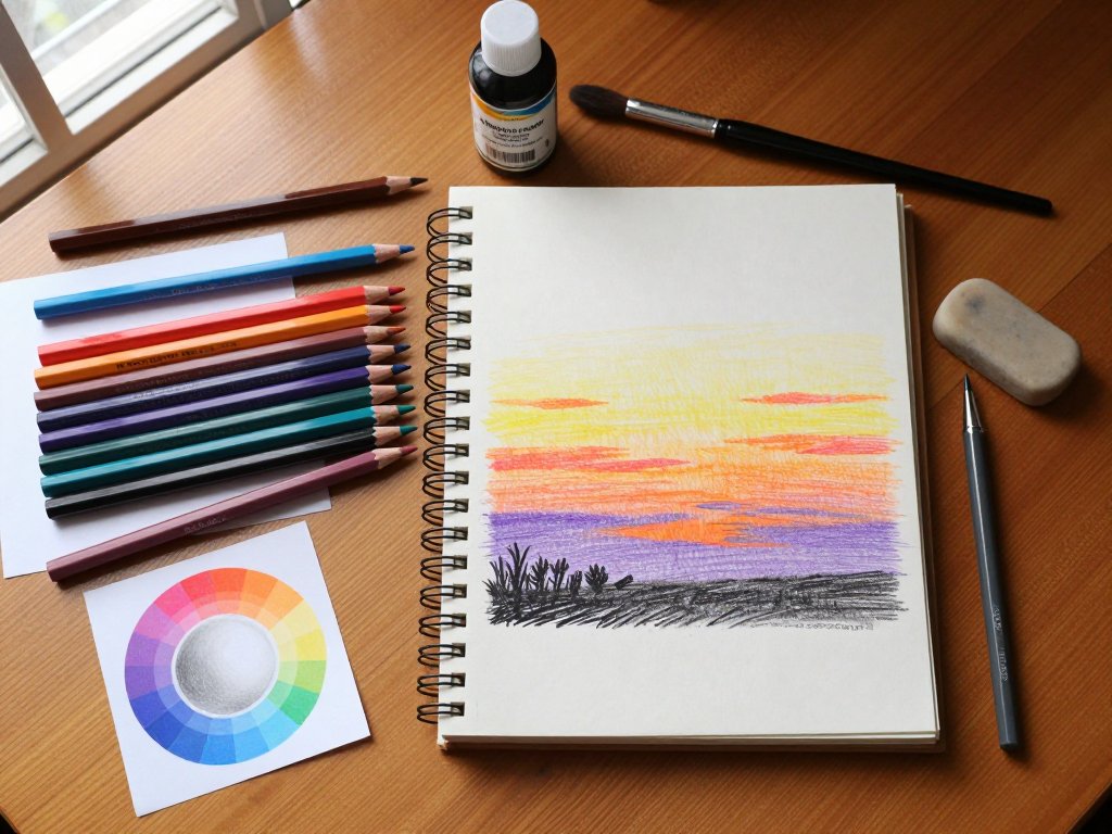
Optional but nice. A pencil for light underdrawing, a kneaded eraser, and a sheet of scrap paper to test pen flow before you hit your good paper.
Add a ruler if you want straight guide lines. Total cost for everything on this list, if you buy new: about twelve to fifteen dollars.
Total cost if you use what you already own: zero.
The First Technique: Basic Hatching
Hatching is the foundation of every pen and ink drawing you will ever make. It is also the one technique beginners overcomplicate because they are too busy worrying about the perfect line spacing.
Here is what hatching actually is: a series of parallel lines placed close together to create the illusion of tone.
Lines that are close together read as dark. Lines that are far apart read as light.
That is the entire mechanism. Nothing else matters until you can control that one variable.
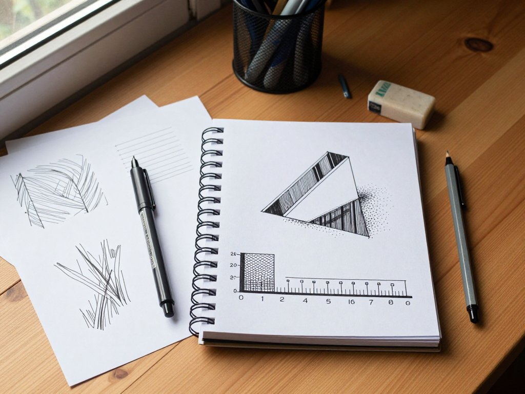
Start with a value scale. Draw a row of five squares, each about an inch across.
Leave the first square empty — pure white paper. In the second square, add sparse hatch lines, about a quarter-inch apart.
In the third, bring them closer, about an eighth-inch apart. The fourth square gets lines almost touching.
The fifth square gets lines packed so densely the paper barely shows through. This exercise takes ten minutes and teaches you more about ink drawing than an hour of reading theory.
The most common mistake beginners make is pressing too hard. The pen does not need pressure to lay down ink — the ink flows from the tip naturally.
Pressing hard just widens your lines unpredictably, makes your hand cramp faster, and wears out the pen tip.
Hold the pen like you are signing a birthday card. That light, relaxed grip is exactly what you want.
Keep your hatch lines parallel to each other, but they do not need to be perfectly straight all the way across.
Slight curves that follow the shape of your subject look more natural than rigid ruler-straight lines.
A cylinder, for example, looks more three-dimensional when your hatch lines curve gently around its surface rather than running straight up and down.
Crosshatching: Building Richer Tone
Once you are comfortable with single-direction hatching, add a second layer of lines going the opposite direction.
That is crosshatching. The first layer runs one way, say from lower left to upper right.
The second layer runs roughly perpendicular, from upper left to lower right. Where they intersect, the tone deepens.
Think of it like this: each layer of hatching is a net. One net catches some light.
A second net laid over it catches more light. A third net, running yet another direction, catches even more.
You control the darkness not by how hard you press but by how many nets you stack.
A practical exercise. Draw a sphere — just a circle about two inches across. Decide where your light source is coming from.
I usually pick the upper left. The highlight will be on the upper left surface, so leave that area nearly white.
As you move down and to the right, add your first layer of hatch lines following the curve of the sphere.
Let the lines arc gently. Then add a second layer perpendicular to the first. Where the sphere curves away from the light entirely — the lower right edge — add a third layer.
You now have a sphere that looks round, lit from one side, rendered entirely with lines.
Crosshatching works best when you let the first layer dry before adding the second. With fast-drying pigment liners this happens in seconds, but it is a good habit to develop.
If you rush and the nib drags through wet ink, you get a muddy spot that is hard to fix.
Work from the lightest areas to the darkest, and let each pass of hatching have a moment to set.
Stippling: Patience Pays Off
Stippling — building tone with individual dots — is the technique that looks the most impressive but requires the most patience. It is also the technique that beginners either love immediately or absolutely cannot stand.
I fell into the "cannot stand" camp at first. My early stippling attempts looked like I had sneezed on the paper.
The dots were uneven, clustered in some spots and sparse in others, and I ended up with a mess that looked nothing like the smooth gradient I wanted.
The problem was that I was trying to place every dot individually instead of developing a rhythm.
The trick to good stippling is to work in passes, just like you do with crosshatching.
First pass: dot the entire dark area evenly, leaving the light areas untouched. The dots should be about a pencil-lead-width apart.
Second pass: go over the same area again, but this time only in the medium to dark zones.
Third pass: only in the darkest zones. Each pass adds density where you need it, and the transition between light and dark happens naturally because you are working in layers.
Stippling works beautifully for textures that hatching cannot capture — the soft surface of a peach, the grain of weathered wood, the foggy atmosphere in a landscape. If your subject has a soft, organic feel, stippling is often the better choice over hatching.
One practical tip: rotate your paper frequently while stippling. If you work from the same angle for an hour, your hand will fatigue and your dots will drift. A fifteen-degree rotation every few minutes keeps your dots consistent because your wrist stays in a comfortable position.
Contour Lines: Giving Form to Your Drawings
Contour lines are the outlines that define the edges of your subject. But if you rely only on outlines, your drawing will look flat — like a coloring book page waiting to be filled in.
The real power of contour lines is that they can do more than just mark boundaries.
Cross-contour lines are lines that run across the surface of your subject, following its form the way topographic lines follow a mountain.
A cross-contour line on a cylinder curves. A cross-contour line on a sphere arcs. A cross-contour line on a crumpled piece of paper zigzags and doubles back.
These lines tell the viewer's eye that the surface has depth and volume.
Try this exercise. Take a piece of crumpled aluminum foil or a wrinkled kitchen towel and set it on your desk under a good lamp.
Spend fifteen minutes drawing only the cross-contour lines — the ridges and valleys created by the folds.
Do not worry about the outline of the object at all. Just draw the internal lines that describe the surface.
The result will look abstract at first, but as you add more lines, the form will emerge on its own.
This exercise is the single most valuable warm-up I do before any ink drawing. It trains your eye to see volume instead of outlines, and volume is what makes ink drawings look like three-dimensional objects rather than flat symbols.
Line Weight and Emphasis
One of the quickest ways to make your ink drawings look more professional is to vary your line weights. A drawing where every line is the same thickness looks mechanical. A drawing where thick and thin lines work together looks alive.
The basic rule: outer contours are heavier than inner contours. The outline of a face should be drawn with your medium pen (0.7mm or 1.0mm), while the details of the eye, nose, and mouth should use your fine pen (0.3mm or 0.4mm).
This creates natural hierarchy. The viewer's eye goes to the details, but the overall shape holds the composition together.
A second rule: lines in shadow are heavier than lines in light. If you are drawing a tree trunk and the light comes from the left, the right side outline should be noticeably thicker. This reinforces the illusion of lighting that you build with hatching.
If you only have one pen — say, a single 0.5mm — you can still create line weight variation by going over a line twice, or by pressing slightly harder and allowing the nib to spread.
This takes practice and does not work with every pen, but it is worth trying before you buy a second pen.
Common Beginner Mistakes and How to Fix Them
I made every mistake on this list so you do not have to.
Mistake one: starting on expensive paper. I cannot stress this enough. Your first fifty ink drawings should be on cheap sketch paper or even copy paper.
Expensive paper creates performance anxiety. You hold your breath, your hand shakes, and the drawing suffers.
Cheap paper is forgiving. You can make a mess, turn the page, and try again with zero guilt.
Save the good paper for drawings that matter after you have practiced the technique.
Mistake two: erasing pencil underdrawings after inking. If you draw in pencil first and then ink over it, wait for the ink to dry completely before erasing the pencil.
If you erase while the ink is still wet, you will smear the ink across your paper.
Even if the ink looks dry, wait fifteen minutes to be safe. Pigment liners dry fast but the surface layer can still lift if you rub it too soon.
Mistake three: overworking a small area. Beginners tend to focus on one corner of the drawing and make it perfect while ignoring the rest of the page.
Step back often. Look at the whole composition. Ink is unforgiving — you cannot erase a misplaced hatch line — but you can learn to work broadly first and refine later.
Do a light pass over the entire drawing before committing to dense detail anywhere.
Mistake four: assuming ink has to be permanent. Not all ink is waterproof. Check the label on your pen.
If it says "water-based" or "water-soluble," your finished drawing can smudge with a damp hand or humid weather.
For drawings you want to keep, use pigment-based ink labeled "waterproof" or "lightfast." This matters most if you plan to add a watercolor wash over the ink, which brings me to the next section.
Combining Ink with Watercolor: The Gateway Technique
Pen and ink plus watercolor is the combination that made me fall in love with drawing. You do the line work — the structural skeleton of the image — and then you let watercolor fill in the color. The ink handles the precision. The watercolor handles the atmosphere.
The key is using waterproof ink. If your ink washes away when you paint over it, you have to redraw the entire line work after the paint dries, which defeats the purpose.
A permanent pigment liner like the Uni Pin Fine Line or Sakura Pigma Micron (the ones labeled "waterproof") will hold its line no matter how much water you brush over it.
Start with a light pencil sketch of a simple subject — a leaf, a fruit, a cup on a table.
Ink the outlines and any internal details you want to keep, using the hatching and crosshatching techniques you have practiced.
Let the ink dry completely. Then take a watercolor brush and lay down a light wash of color over the inked areas.
The ink lines show through the paint, giving the image structure, while the watercolor adds warmth and softness that ink alone cannot achieve.
This technique is how many of the ink illustrations you see in magazines and cookbooks are made. It looks sophisticated, but it is one of the simplest ways to combine two forgiving mediums into something impressive.
Building a Practice Routine That Sticks
The hardest part of learning any new skill is not the skill itself — it is showing up consistently. I have found that a fifteen-minute daily practice routine works better than a two-hour session once a week. Here is a structure that works.
Days one through three: Value scales. Draw five squares and practice hatching them from light to dark. Then do the same with crosshatching. Then with stippling. Fifteen minutes per day, nothing fancy. Just your hand learning how much spacing produces which tone.
Days four through six: Simple objects from around your house. A coffee mug on your desk.
A spoon. A shoe. Spend fifteen minutes drawing each one using only hatching for shading.
Do not erase or restart. If a line goes wrong, incorporate it into the drawing.
Ink does not forgive mistakes, but it also does not care if you work around them.
Day seven: Review the week's drawings. Pick the one you like least and redraw it using the same subject but a different shading technique.
If the first version used hatching, try crosshatching or stippling this time. Compare the two and notice how different the same subject looks with a different technique.
After two weeks of this routine, you will have a dozen practice drawings and a clear sense of which techniques feel natural to you. Some people love stippling. Others cannot stand it. Both are fine — just different paths to the same goal.
The Bottom Line
Pen and ink drawing is one of the few art forms where you can produce gallery-worthy work with less than fifteen dollars in supplies. The barrier is never the cost of the tools. It is the willingness to make twenty bad drawings before you make one good one.
I still have the first ink drawing I made after that failed attempt with the expensive Micron set.
It is a lopsided mug that looks more like a deformed potato than a drinking vessel.
But I keep it tacked to my studio wall because it reminds me that the only way to get good at ink is to use ink badly for a while first.
Grab whatever pen you have within arm's reach. Draw five parallel lines on a scrap of paper. Make them evenly spaced. Then draw another set crossing them. That is all it takes to start. The rest is just practice.