Introduction
The first time I opened a tube of gouache, I was twenty-three, sitting on the floor of a cramped apartment in Portland, and I had no idea what I was doing.
I had bought the set on a whim, lured by the cheerful row of little white tubes in a cardboard box.
The woman at the art supply counter looked at my selection and said, "You're going to love this stuff.
It's watercolor that knows what it wants." I didn't understand what she meant then, but I've never forgotten her phrasing.
That afternoon I sat cross-legged with a jelly jar of murky water, a pad of paper I'd grabbed without thinking, and those pristine tubes of color.
I painted a pear. It was lopsided. The green was too bright. The shadow looked like a bruise.
And yet — I felt something click. The paint was doing what I wanted it to do.
Mostly. For the first time in months of trying to learn watercolor and feeling perpetually defeated, I had found a medium that met me where I was.
That pad, I later realized, was toned paper — a warm, soft gray between the white of the page and the dark of my pencil lines.
It wasn't a fancy choice. It was what was on sale. But it was the best accident of my early painting journey.
The paper was doing half the work, providing a middle ground that made my muddy attempts look intentional.
And the gouache, creamy and opaque, sat right on top of that gray like it belonged there.
If you are reading this because you want to paint but feel intimidated by watercolor's precision or acrylic's permanence, let me tell you what I wish someone had told me on that Portland floor: gouache on toned paper is the friendliest gateway into painting that exists.
It forgives your mistakes. It lets you paint dark over light. It dries matte and photographs beautifully.
And the paper becomes a partner — a third color that holds everything together before you have mixed a single hue.
What Exactly Is Gouache?
Gouache (pronounced "gwash") shares its binder — gum arabic — with watercolor. It activates with water, cleans up with soap, and behaves like the transparent watercolors you might have used in school. But one critical difference changes everything: gouache is opaque.
Where watercolor relies on the white of the paper for luminosity, gouache contains enough pigment and filler that it sits on top of the paper like velvet.
You can paint a dark shape, let it dry, and paint a lighter shape directly over it.
The light color covers the dark. For a beginner, this is revolutionary. In watercolor, you must plan your whites in advance, preserving them with masking fluid.
One wrong stroke and that cloud you wanted white is a lost cause. In gouache, you paint your dark shapes first — the shadows, the deep tones — then come back with lighter colors and paint the highlights on top.
It is painting in reverse, and it is enormously freeing.
Gouache dries to a matte, velvety finish. No glossy shine like acrylic or oil. It sits flat on the page, making it a dream for photography — no glare to fight.
There is one quirk: gouache shifts slightly lighter as it dries. This "drying shift" trips up every beginner.
The cure is simple — mix a little darker than you think you need. Nine times out of ten, it will dry exactly right.
Why Toned Paper Is a Beginner's Best Friend
Most of us learned to paint on white paper. It is the default, but it presents a hidden challenge: every single value decision is entirely on you. You must decide where the whites, grays, and blacks go, starting from a blank slate every time.
Toned paper — paper in a middle value of gray, tan, or kraft brown — eliminates one of those decisions before you start.
The paper itself becomes your mid-tone. Your shadows go darker than the paper. Your highlights go lighter.
Instead of needing a full range of values from scratch, you only need two: darker than the paper, and lighter than the paper.
The middle value is already there, holding everything together.
This is transformative for a beginner. Judging values — how dark or light a color is relative to others — is arguably the hardest skill to develop.
Our eyes get tricked by color and context. Toned paper gives you a fixed reference point.
You hold your brush up against the paper and ask: is this darker or lighter than the gray?
If it is about the same, you are in mid-tone range. If it is darker, it reads as shadow.
If it is lighter, it reads as highlight.
My first toned pad was Strathmore's 400 Series in warm gray, and I still buy it out of sentiment.
Kraft paper is a wonderful inexpensive option. Canson makes Mi-Teintes in a rainbow of mid-tone colors.
You can even tone your own paper by brushing a thin wash of watercolor over any sheet and letting it dry.
For a beginner doing a first fruit study, I recommend a mid-tone warm gray — neutral enough not to distract, warm enough to make most colors look pleasing.
Essential Supplies: What You Actually Need
Gouache demands very little equipment. You do not need a sprawling studio or a collection of forty brushes. Here is what you actually need.
Gouache Paint
Student-grade gouache is often more forgiving than artist-grade — more opaque and consistent across colors.
Start with a set of at least twelve colors. Arteza makes a solid beginner set.
Himi gouache, sold in those adorable jelly cups, is creamy and inexpensive. For the fruit study, you need these specific colors: a warm red (cadmium red or naphthol red), a cool yellow (cadmium yellow or Hansa yellow), a warm yellow (yellow ochre), an earthy brown (burnt sienna or raw umber), and white (titanium white — get a large tube, you will use a lot of it).
Those five colors plus the gray of your paper are enough to paint a very convincing apple or pear.
Toned Paper
Strathmore's 400 Series Toned Sketch pad in gray or tan is my top beginner recommendation. Whatever you choose, make sure it is at least 98 lb / 160 gsm — heavy enough to take water without buckling.
Brushes
You only need three synthetic round brushes to start: a #2 for details, a #6 for general painting and medium shapes, and a #12 for washes and large areas. That is it. Three brushes will get you through your first year of painting.
Everything Else
Two jars of water — one for rinsing, one for clean mixing water. Paper towels.
A palette — a plain white dinner plate works perfectly. A pencil for sketching. A kneaded eraser.
And a small spray bottle to mist your gouache if it starts drying out while you work.
You probably already own half of these things.
Core Techniques: The Vocabulary of Gouache
Opacity Is Your Superpower
The single most important thing to internalize: gouache is meant to be opaque. If you add too much water, it becomes transparent, and you lose every advantage of the medium.
The consistency you want is like heavy cream or melted ice cream — it should flow off your brush but not drip.
It should cover the paper in one stroke without letting the color underneath show through.
If you are used to watercolor, this will feel wrong. Resist the urge to add more water. Load your brush confidently and lay the paint down.
Layering: Dark to Light
Start with your darkest values — the deep shadows. Block them in with opaque paint. Let them dry. Then move to your mid-tones, lighter than your shadows but darker than your paper. Let those dry. Then add your lightest values and highlights on top.
Working dark to light turns painting from an anxious, careful process into a confident, additive one. You can always come back with light paint. Nothing is permanent until you decide it is.
Reactivating Dried Paint
Gouache is water-soluble even after it dries. You can wet a brush, go back to an area you painted ten minutes ago, and the paint will lift and move.
This is useful for softening edges and correcting mistakes. But it means you need to let each layer dry fully before painting over it if you want clean, opaque coverage.
The control is yours — you just have to be intentional.
Creating Soft and Hard Edges
A hard edge is a sharp boundary between two colors. A soft edge is a gradual transition.
Create a hard edge by painting two colors next to each other and letting each dry before painting the adjacent area.
Create a soft edge by blending while wet or running a clean, damp brush along a dry edge to blur it.
Use hard edges for crisp contours — the outline of a fruit against a background, a bright highlight on a glossy surface.
Use soft edges for fuzzy or distant areas — the shadow under a pear, the transition from light to dark on a rounded form.
A painting with all hard edges looks stiff. A painting with all soft edges looks muddy.
The dance between them is where the life lives.
Using the Paper's Mid-Tone as Your Third Color
This is the secret that will make your early paintings look better than you expect.
Your toned paper is not just a surface — it is your mid-value color. Wherever you leave the paper bare, you are effectively painting with that color.
If you are painting a pear, leave the paper showing in the area between the shadow and the highlight, and it reads as the local mid-tone.
Your shadows go darker. Your highlights go lighter. The paper sits in between, doing the work of a third color without your having to mix anything.
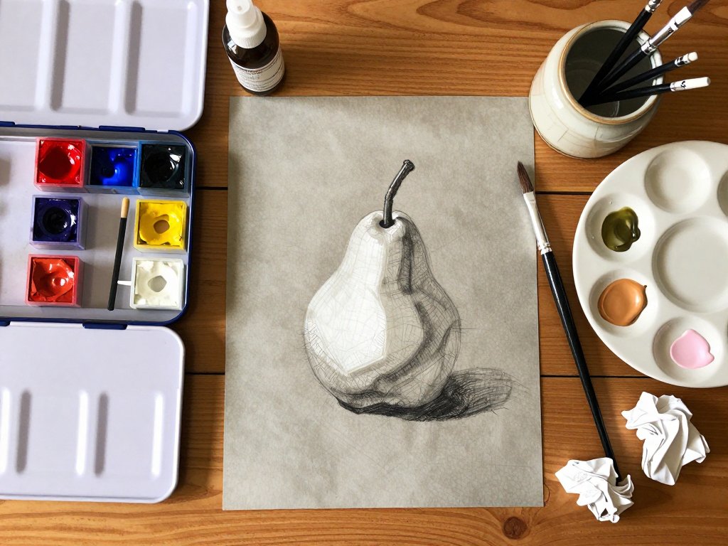
Step-by-Step Mini-Project: A Simple Fruit Study
Find a piece of toned paper, your gouache set, your three brushes, a jar of clean water, and a paper towel.
Find a piece of fruit — a pear is ideal for your first try because its simple, asymmetrical shape is forgiving, and its range of warm yellows and browns is satisfying to mix.
Position it in good natural light coming from one side.
Step 1: Sketch
Lightly pencil the outline of your fruit. Mark the location of the stem and the highlight area (a small circle where the light is brightest). Lightly sketch the cast shadow on the table.
Step 2: Mix Your Three Values
On your palette, mix three puddles of paint. These are the only colors you will use for the entire study.
Dark value: For a red apple, mix deep burgundy from red plus a touch of burnt sienna and a dot of ultramarine or Payne's gray.
For a yellow-green pear, mix yellow ochre plus burnt sienna plus a touch of ultramarine until you get a warm, deep olive-brown.
This should be notably darker than your toned paper.
Light value: Mix white with a small amount of your fruit's local color. For a red apple, white with a hint of red for a soft pink-white. For a pear, white with a tiny bit of yellow ochre. This should be notably lighter than your paper.
Mid-tone value: This should match your toned paper as closely as possible. Mix your fruit's local color with a touch of white and a tiny bit of your dark mix until the value sits at the level of your paper.
Step 3: Paint the Shadow
Using your size #6 brush, load your dark mix and paint the shadow areas — the side opposite the light, the curve near the stem, the area where the fruit meets the table. Paint the cast shadow too. Let this dry.
Step 4: Paint the Mid-Tone
With a clean brush, load your mid-tone mix and fill in the body of the fruit outside the shadow area. Leave the highlight area bare. Let the mid-tone overlap the edge of the shadow slightly to soften the transition.
Step 5: Paint the Highlight
Once the mid-tone is dry, switch to your size #2 brush and your light mix.
Paint a small, crisp area where the light hits the fruit most directly. A highlight on a glossy fruit is usually a small crescent or oval — keep it contained.
Let the paper's warm gray glow through around it.
Step 6: Add the Stem and Finishing Touches
Mix dark value with a touch more burnt sienna for warmth, and with your size #2 brush, paint the stem.
Add a small shadow on one side of it. Step back. Look at your painting.
The toned paper is unifying everything. The dark shadows anchor the form. The highlight gives it life.
The bare paper in between reads as the true mid-tone. You have painted a three-dimensional form using three values on one sheet of paper.
That is the foundation of representational painting.
Why Beginners Fall in Love with Gouache
I have taught gouache workshops to absolute beginners, and I have seen the same thing happen over and over.
A person sits down looking nervous, convinced they cannot paint. An hour later, they are holding up a painting of a lemon or a leaf, smiling — not a polite smile, but a genuine, surprised, delighted one.
Gouache does that to people.
It is forgiving in a way other mediums are not. Watercolor punishes hesitation — every stroke leaves a permanent mark.
Acrylic dries fast and cannot be reactivated. Oil is beautiful but slow, expensive, and requires solvents.
Gouache sits in a sweet spot: water-soluble so it cleans up easily, opaque so you can fix mistakes by painting over them, quick-drying so you see results in minutes, and matte so it photographs beautifully without glare.
There is something deeply satisfying about the physical feel of gouache — the creamy, buttery texture as it spreads across paper, the velvety finish when it dries, like a sheet of colored felt.
I have watched people who claim they have no artistic talent produce paintings that surprise them, simply because the medium is so cooperative.
And it is portable. You can tuck a small gouache set, a water brush, and a toned pad into a bag and paint anywhere.
Troubleshooting: When Things Go Wrong
"My Paint Looks Chalky and Dusty"
This is the most common problem for new gouache painters, and it is almost always caused by using too much water.
When you thin gouache too much, the pigment particles separate, leaving a powdery layer. The fix: use less water.
Aim for the consistency of heavy cream. If the paint is already on the paper and looking chalky, apply a second, thicker layer on top once the first layer is dry.
"My Colors Are Turning Muddy"
Mud happens when you mix too many colors together. Each new color reduces saturation, pulling toward neutral gray-brown.
The fix: limit your palette. Clean your brush thoroughly between colors — residual paint on a dirty brush is a major source of accidental mud.
For the fruit study, you used only three puddles plus white. That discipline serves you well.
"I Cannot Get Solid Coverage"
If your gouache is streaky and transparent, you are not using enough paint. The fix: load your brush with more paint.
A single, confident stroke with a fully loaded brush gives better coverage than three timid, watery strokes.
If the first layer dries streaky, let it dry completely and apply a second layer on top.
Two thin layers of opaque paint are often more beautiful than one thick one.
"My Paint Cracked When It Dried"
Cracking happens when you apply gouache too thickly — almost no water, just straight pigment paste. The fix: thin your paint just slightly with a drop of water. Gouache should be creamy, not pasty. Build up texture in thin layers rather than one globby application.
Conclusion
I still have that first painting of a pear, tucked into a drawer in my studio.
It is not good by any reasonable standard. The proportions are wrong. The colors are naive.
The stem looks like a startled eyebrow. But I keep it because it reminds me of what it felt like to discover that I could paint — that the medium and I could work together, that I did not need to be born with talent to make something I was proud of.
Gouache on toned paper is not a compromise or a stepping stone to a "real" medium.
It is its own beautiful, complete practice. Artists like Egbert Modderman and Emily Sutton use it as their primary technique, producing luminous, nuanced work.
It is rooted in tradition — designers have used gouache for concept art and illustration for decades — but it has seen a wonderful resurgence among new painters who appreciate its forgiving nature and modern matte finish.
So let me leave you with this. Buy a tube of white gouache — a big one.
Find a pad of toned paper — gray, tan, anything not white. Set out a jar of water and a brush.
Pick a piece of fruit from your kitchen. And paint it. Not because you need to produce a masterpiece, but because the act of mixing a color to match what you see, of laying down a stroke of opaque paint and watching it transform a flat surface into something dimensional, is one of the most quietly satisfying things a person can do with an afternoon.
Do not worry if it goes wrong. The first few will go wrong. But somewhere around the third or fourth attempt, something will click.
The paint will do what you ask. The paper will hold your values in place.
And you will look at your lopsided, earnest little pear and realize: I made that.
I can make another. And the next one will be better.
That is how every painter starts. That is how I started, on a floor in Portland, with a jelly jar and a half-off pad of gray paper. And I never stopped.