Introduction
In the bottom of my grandmother's cedar chest, under the good tablecloths, there was an envelope of photographs from a trip she took to Italy in 1974.
Forty-one snapshots, all slightly orange, all taken with the same little camera she bought at a drugstore the week before she left.
Here is the strange part. What she told me about that trip was never in those photographs. The photographs were of walls. What she remembered was the smell of the bakery under her window.
She meant to paint it. She talked about it for thirty years, and the painting stayed in her head, where it was perfect and safe and never quite finished.
This guide is my attempt to keep that from happening to you.
Painting from your own travel photographs is one of the kindest ways for a beginner to make art, because you already know what you love about the place.
The skill you are learning is not drawing. It is choosing what to keep.
Why Painting from a Photograph Is Not Copying It
The first thing to understand is that a camera and a person are not collecting the same information.
A camera flattens the world in a single instant, at a single exposure. Your eye, meanwhile, wanders, adjusts, and edits without asking you.
Your eye forgives the grey car park behind the harbour. The camera records every inch.
Lenses also lie about shape. A wide phone lens bows the edges of a room, makes cliff faces lean backward, and stretches whatever sits near the corners.
Print a seaside photograph and you will often find the horizon faintly curved, and the nearest table enormous.
And the camera notices detail the eye never noticed at all. Four thousand individual leaves. A fire hydrant. A tour guide's yellow umbrella directly behind your daughter's head.
So copying a photograph produces a strange, anxious painting. All the facts, none of the feeling.
You are not copying. You are translating. A photograph is a record; a painting is a memory with the boring parts removed.
Choosing a Reference Worth the Hours
Most disappointing beginner paintings fail before the first brush stroke, because the reference was never paintable.
Stand back from your screen and squint at a candidate photograph. If it turns into a grey mush, it is not your reference.
Look for four things before you commit.
- Strong, simple shapes. Three or four big masses you could cut out of card and recognise from across the room.
- One clear light direction. Sun from the side, or a window, or a bright overcast sky. You need to know instantly which side is lit.
- A story you actually remember. Not the most spectacular view of the trip. The one you still describe at the dinner table.
- Recognisable midtones. Flat tourist snaps have a bleached sky and a black foreground with nothing in between. You want a photograph with real, readable greys.
Underexposed photographs are better references than overexposed ones. A slightly dark image still holds its midtones; a blown-out sky holds nothing.
If a photo is nearly right, fix it on your phone before you print it. A little shadow lift and a small crop can rescue a reference completely.
Then put the other forty photographs away. One reference, one painting.
Cropping, Composition, and the Courage to Leave Things Out
New painters treat the photograph frame as sacred. It is not. It is a starting suggestion from a stranger with a phone.
Start by cropping on your screen. Zoom until the interesting shape fills the frame, then pull back a fraction.
You can also cut two L-shaped cards and hold them up over a printed photograph. Slide them until the composition clicks. It feels old-fashioned and it works.
Now think about thirds. Imagine the frame divided into nine equal rectangles, and place your horizon and your main vertical near those lines rather than dead centre.
A horizon at the very middle splits a painting into two halves that argue with each other. A horizon at the upper or lower third lets one part lead.
This is the moment for courage. Anything you cannot remember clearly from the trip is a candidate for deletion.
Out goes the parked van, the tangle of overhead cables, the third row of café chairs, and the stranger in the red raincoat.
Every object you remove makes the remaining objects louder. Beginners add. Painters subtract.
Setting Up: Printing Your Reference and Keeping It at Eye Level
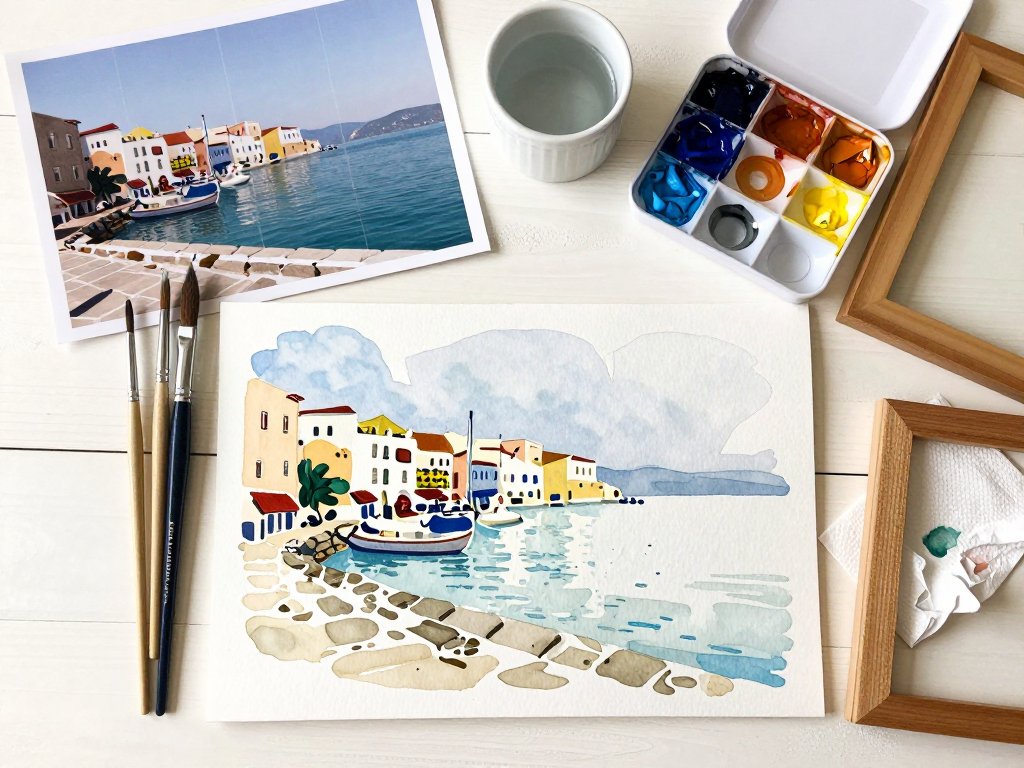
Print your chosen reference on matte paper at roughly six by eight inches, or eight by ten if you are working large.
Matte matters, because a glossy print throws a rectangle of glare exactly where you need to see the darks.
Ordinary printer paper is fine. Cheap, light, and easy to scribble on, which is the whole point.
Tape it at eye level, near your easel or drawing board, at about the same distance as your painting. Not flat on the table beside you.
A flat reference forces you to look down and then up, and your eye quietly re-invents the values each time it travels.
Now add a second, larger sheet of plain paper beside the print. This is your value sketch, and it comes before any colour.
Squint hard at your reference until the details fall away and only the big pale and dark shapes remain.
Draw a small rectangle, no bigger than a playing card, and fill in just three tones: your lightest light, one middle, your darkest dark.
Marker is perfect for this. So is a soft pencil used flat, or three greys torn from a magazine.
Five values is the next step up, if three feels too blunt. Add one value lighter than your middle and one darker.
Number them on the sketch. Name where each one goes.
The value sketch is a map. Without it, you will paint the details you can see and miss the pattern that makes the scene work.
Four to Six Colours, Mixed Into a Family
Colour is where enthusiastic beginners lose a painting. Fifteen tubes on the table means fifteen temptations to fiddle.
Choose four to six colours for the whole piece and nothing else. A reliable travel set might be ultramarine blue, burnt sienna, yellow ochre, a warm red, and titanium white.
That is a coastline, a market square, a mountain valley, and a rainy street, all from five tubes.
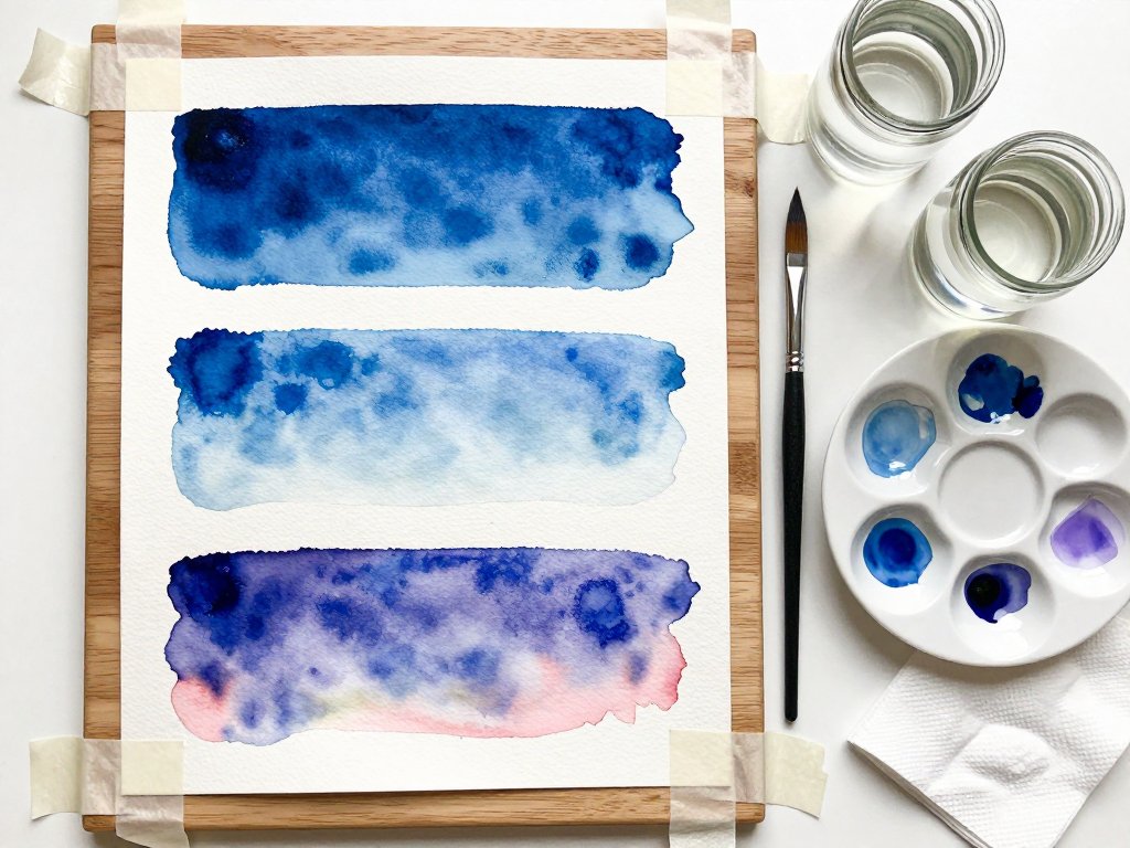
Before you touch the painting, mix each of your colours into a family of three in your palette wells.
A family is the same colour at three strengths: a pale wash, a middle, and a strong dark.
Do this for your sky colour, your ground colour, and your shadow colour. Nine small puddles, mixed and waiting.
Test each one on a scrap of your actual painting surface. Colour looks different on paper than on a palette.
Working from pre-mixed families is what keeps a painting looking like one afternoon of light rather than five unrelated hours.
Add a colour mid-painting only if the whole piece demands it. It rarely does.
Getting the Drawing Down and Blocking In Big Shapes
If drawing frightens you, say so out loud and then take the shortcut. Nobody hands out medals for freehand.
Two options work well for photographic references.
- The grid. Draw a four-by-four grid on a tracing-paper copy of your printed reference, then the identical grid, lightly, on your painting surface. Copy one square at a time.
- Proportional measuring. Note where three or four landmarks sit, as fractions of the whole width and height. A tree at one-third across and half way up. Join the dots.
Keep the drawing faint. Thick pencil lines persuade you that every edge is a hard edge, and most of them are not.
Then block in the big shapes, largest first, with your biggest brush and no detail at all.
- The largest light area. Usually the sky, or a sunlit wall.
- The largest dark area. Often the foreground shadow or a mass of trees.
- The middle-sized shapes between them.
- Only then, the middle values that tie the two families together.
Walk away and look from across the room. If the block-in already reads as your place, the painting is going to work.
Save every edge, every window, every glint of water for the last twenty percent of your time. Detail is dessert, not dinner.
Watercolour, Acrylic, or Gouache for Photo Work
All three media will paint a photograph beautifully, and all three solve a different problem.
- Watercolour is the best choice for light, air, and distance. It dries fast, travels well, and gives you skies that no other medium touches. It is unforgiving of corrections, so pair it with a careful value sketch and a limited palette.
- Acrylic is the best choice if you like to change your mind. It dries to a tough matte film, covers anything underneath, and lets you paint over a mistake completely. Brushes need rinsing constantly, because acrylic dries in the ferrule.
- Gouache sits between the two. Opaque like acrylic, but it re-wets with water, so you can push colours back into softness hours later. It is superb for busy market scenes and night lights, and it dries slightly darker than it looks.
If you are unsure, paint your first travel reference in whichever of the three you already own.
Matching medium to subject matters more than brand. Soft, hazy landscapes belong to watercolour; crisp architecture and strong pattern belong to acrylic or gouache.
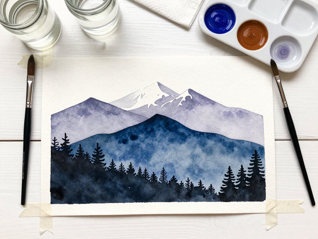
For a photographic reference with layered receding distance, our guide to watercolor mountains layered landscapes made easy shows how far three washes and a dry brush will carry that idea.
When It Goes Wrong: Mud, Overwork, and Flat Midtones
Three problems account for nearly every disappointing photo painting. All three are fixable, and none of them mean you are untalented.
Muddy colour almost always comes from overmixing. Every extra stir pushes transparent washes toward grey, and mixing more than three pigments guarantees it.
Fix it by not stirring. Charge the brush, lay the colour down, and let the paper do the blending.
Overworking is the second thief, and it feels like virtue while you are doing it. The fourth pass over a wet field, the little adjustments to a cloud, the tidy-up of an edge that was already fine.
Freshness is a record of decisions, not of effort. The fix is to step back and set a timer between passes.
All-midtones flatness is the most common problem of all. You copied the grey middle of the photograph faithfully and reproduced it perfectly.
The cure is contrast, not more colours. Push your darkest dark genuinely dark, protect your lightest light as bare paper or pure white, and let the middle do less work.
If you have already gone too far on a painting, stop adding. Try one of these rescues instead.
- Glaze a single thin wash of one unifying colour, such as a warm ochre, across the whole piece and re-establish the light and dark again.
- Lift back or scrub out your highlights, then restate the silhouette of the main shape.
- Cover the weakest third with a foreground shape you do remember: a wall, a shadow, a hedgerow.
- Start a second version of the same reference. It will take half the time and be twice as confident.
Memory, Feeling, and Where Inventing Is Allowed
Here is the freedom that painting from your own photograph gives you, and it is the whole reason to work this way.
You are not aiming for pixel accuracy. You are aiming for the version of the place that lived in your chest.
That means you may warm a sky that was actually grey, because in memory it was a good afternoon.
You may soften a crowd into three soft strokes of colour. You may straighten a leaning lamp post, move a tree two feet left, or delete the fire hydrant entirely.
You may also pull one colour through the whole painting a little more than it appears in the photograph, so that the picture feels like one piece instead of two.
What you should not invent is the light. If the sun is on the left, every shadow belongs on the right, all the way to the last stroke.
A shape can be simplified, but the direction of the light has to stay honest. That single rule keeps an invented painting believable.
So ask, before every decision: does this make the memory truer, or just more detailed?
Finishing a Travel Piece: Signing, Framing, and a Small Series
Let the painting dry properly before you decide anything about it. Paintings look better in the morning, and slightly worse at four in the afternoon.
Sign it small, in a quiet corner, with a fine liner or a rigger brush. Name and year on the back, written in pencil.
Acrylics want two or three thin coats of matte varnish, applied after the paint is fully cured. Thin coats, or the surface goes cloudy.
Watercolour and gouache are happiest behind glass, with an acid-free mat so the paper never touches the glazing. A simple wood frame does the rest.
Hang it near a lamp, at eye level, where you will pass it every day. Travel paintings are for looking at on a Tuesday, not just for guests.
Then start a series. Same size panels, maybe six by six inches, one for each stop on the trip.
Small sizes are quick, they hang beautifully in a row, and the practice compounds faster than any single large canvas.
My grandmother never painted her bakery. But she left me the photographs, and I have been painting my way through them for two years now.
Yours are already sitting in a drawer somewhere. Print one this afternoon, tape it at eye level, and mix four colours.
Paint the place the way you remember it, not the way the camera caught it. That is the only version worth having on the wall.