Introduction
My grandmother's watercolor tin still sits on my shelf. It is a battered metal box from the 1960s, and when I lift the lid, the paints are arranged in two neat rows: twelve colors, most of them untouched.
The pans of ultramarine and rose are worn down to the metal, but the greens and violets and the little tube of white that watercolorists never use look as fresh as the day she bought them.
She painted every Saturday morning for forty years, and she almost always reached for the same three colors.
If you have ever stood in an art supply aisle staring at a ninety-nine-color set and felt your heart sink a little, this article is for you.
I want to show you why a limited watercolor palette is not a restriction — it is a release.
Fewer paints mean less money spent, less time fiddling, and a quieter mind at the easel.
And the colors you mix yourself will always belong to your painting in a way that squeezed-from-the-tube colors never quite do.
Let us start with a question, and there is no wrong answer: when you look at a set of watercolors, do you feel excited, or do you feel overwhelmed?
Why Less Really Is More
Here is the honest truth that took me years to learn. Most of us use about a quarter of the colors in a big set, and we use them badly because we never learn to mix them.
We grab sap green for a leaf, reach for a tube of burnt sienna for a branch, and then wonder why every painting has that same slightly muddy, store-bought look.
A limited palette changes the conversation. When you own three, five, or six colors, you cannot reach for a shortcut. You mix, and mixing is where watercolor becomes yours.
There are real, practical benefits to a small palette:
- Better harmony. When every color in a painting shares the same three parent pigments, the painting naturally holds together. The greens, the skin tones, and the shadows all belong to one family.
- Less overwhelm. A blank sheet of paper is already intimidating. A tray with three colors whispers "you can do this" instead of shouting a hundred options at you.
- More money for better paint. Three professional paints cost about the same as one student set of twenty-four. Quality beats quantity in watercolor every single time.
- Faster cleanup and setup. Ten minutes at the kitchen table is enough for a full painting session when your palette fits in your palm.
I remember the afternoon I finally understood this. A painter friend came to visit and unpacked a tiny tin with exactly three pans inside.
She painted a bowl of lemons, a china cup, and a shadowed corner of the table using only those three colors, and the result was richer than anything I had produced with my twenty-four-color set all year.
"The colors mix themselves," she said. "I just decide where they land."
The Three Paints That Do the Work
If you are starting from scratch, do not buy six colors. Buy three. My favorite starter trio, and the one I give to every friend who asks, is a warm yellow, a cool red, and a blue with a hint of violet in it.
In plain terms, that means:
- Hansa yellow medium — a sunny, slightly warm yellow that leans toward orange. It mixes the warmest, most cheerful greens.
- Quinacridone rose — a cool, clear pink-red that leans toward violet. It is the workhorse of skin tones and the secret to beautiful purples.
- French ultramarine — a deep blue with a touch of warmth. It makes rich violets with the rose and lovely soft greens with the yellow.
Those three paints alone can mix an astonishing range of colors. Ultramarine and rose give you violets and lavenders. Yellow and blue give you greens. And all three together, in careful amounts, give you the soft grays and browns that make shadows feel alive.
You do not need to remember pigment codes or brand names yet. Just look for three tubes or pans whose names contain the words above, and check that each one lists a single pigment on the label.
Single-pigment paints mix cleanly. Pre-mixed convenience colors — the ones labeled "olive green" or "dusty rose" — carry hidden pigments that turn your mixtures to mud.
That lesson cost me a whole summer of gray-brown paintings, so let me save you the trouble.
Choosing Your Own Starter Palette
Once you are comfortable with three colors, the natural next step is six. This is the classic "split primary" palette: a warm and a cool version of each primary color, so you can mix anything without mud.
Here is the set I landed on after years of experimenting:
- Lemon yellow (cool, leans green) and hansa yellow medium (warm, leans orange)
- Quinacridone rose (cool, leans violet) and cadmium red or pyrrole red (warm, leans orange)
- Phthalo blue (cool, leans green) and French ultramarine (warm, leans violet)
With those six colors, you can mix nearly every hue in nature. Bright spring greens come from lemon yellow and phthalo blue. Warm sunset oranges come from hansa yellow and pyrrole red. The deepest, richest violets come from ultramarine and quinacridone rose.
Should you buy pans or tubes? For a limited palette, I recommend tubes. You can squeeze exactly the amount you want into an empty pan, let it dry, and carry a palette that cost you a fraction of a pre-filled set.
A small metal or plastic palette with wells, a tube of each paint, and a spritz of water is all the equipment you need.
And do not worry about artist grade versus student grade. Student-grade paints from a reputable brand are perfectly lovely for learning. Buy the small size, use it until the pan is empty, and upgrade one color at a time when a particular paint earns its place in your daily rotation.
Color Mixing Basics, Gently
Let us back up for a moment and talk about how watercolor actually mixes, because the rules are a little different from what school taught us.
Remember the color wheel: red, yellow, and blue are the primaries. Orange, green, and violet are the secondaries, made by mixing two primaries.
Everything else — the browns, the grays, the dusty olive greens — comes from mixing all three primaries together in uneven amounts, or from mixing a primary with the secondary opposite it on the wheel.
Three habits will improve your mixing more than any other advice I can give you:
- Mix on paper, not in the well. Dab a little of each color side by side on your paper and let them blend where they touch. This is the classic "wet-in-wet" moment that makes watercolor magical, and it keeps your palette clean.
- Wet the paint first. Give each pan a drop of water and a few seconds to soften before you touch it with your brush. Dry paint grabs pigment unevenly and makes streaky mixes.
- Think about value, not just color. Value is how light or dark a color is. Squint at your subject and notice that a red apple is often darker than a brown branch. Mixing a color is only half the job; deciding how light or dark to paint it is the other half.
One more gentle reminder: you will make muddy colors, and that is not failure. Mud is information. It tells you that you mixed all three primaries in roughly equal amounts, and next time you will add more of one color and less of the others.
Warm and Cool: The Secret to Clean Mixes
This is the idea that unlocks everything, so let us take it slowly.
Every color leans either warm or cool. A warm red leans toward orange. A cool red leans toward violet. A warm blue leans toward violet. A cool blue leans toward green. Knowing which way your paints lean tells you what a mixture will do before you even touch the brush.
Here is the practical rule that changed my paintings: to mix a clean secondary color, choose two paints that lean toward each other.
Want a bright, singing orange? Mix a warm red with a warm yellow. Want a soft, natural green? Mix a cool yellow with a cool blue. Want a luminous violet? Mix a cool red with a warm blue.
And here is the flip side of the same coin. If you mix a warm yellow with a cool blue, you get a gentle olive green — perfect for leaves and landscapes.
If you mix a cool red with a cool blue, you get a dusty gray-violet, ideal for shadows.
These "opposite lean" mixes are not mistakes. They are how you paint the natural world instead of a crayon box.
When a mixture comes out looking flat or dirty, ask yourself one question: did I use a color that leans the wrong way? Most beginner mud is simply a warm blue and a cool red meeting in the middle.
Palette Recipes I Return To
Over the years I have collected a small notebook of favorite mixtures. Here are the ones I use most, written out like recipes so you can try them tonight.
- Soft leaf green: hansa yellow medium with a touch of ultramarine. Add more yellow for spring, more blue for deep summer foliage.
- Bright spring green: lemon yellow and phthalo blue, mixed in roughly equal parts.
- Warm skin tone: quinacridone rose with a little hansa yellow, then a whisper of ultramarine to pull it into the shadows.
- Rich neutral gray: ultramarine with a dab of quinacridone rose. This is my favorite shadow color for white objects — much more alive than black.
- Deep, almost-black dark: ultramarine, rose, and a tiny touch of yellow. Let it dry and glaze again for the darkest shadows in a painting.
- Earthy brown: any blue mixed with any warm orange or red, then softened with a little yellow.
Notice a pattern? Every recipe uses two colors, sometimes three, never more. The simplest mixtures are the ones that look most alive on the page.
Copy these into your own sketchbook, but do not stop there. The real joy is inventing your own.
Pick any two colors from your palette, mix them in three different proportions, and write down what you see.
In a month you will have a personal recipe book no one else owns.
Painting Exercises to Build Confidence
Watercolor rewards practice the way knitting rewards patience — quietly, steadily, one stitch at a time. Here are four exercises that build real skill without requiring a masterpiece.
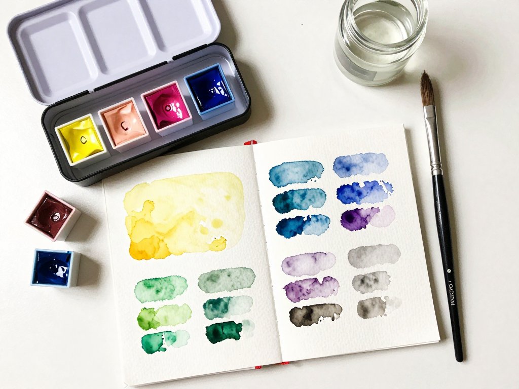
- Make a color chart. Draw a grid, put your three colors along the top and the side, and fill in every possible two-color mixture. This is the single most useful hour you can spend with your paints, and it doubles as a gorgeous reference page.
- Paint a value scale. Choose one color and paint a row of five squares from barely-there to deep and rich. Repeat with each color on your palette until you can judge value without thinking.
- Paint ten-minute skies. Wet a small piece of paper, drop in a wash of ultramarine at the top, and let it fade downward. Add a dab of rose where the sun would be. Do this on scrap paper every day for a week and watch your washes become confident.
- Paint in monochrome. Paint an entire little scene using only ultramarine. You will be amazed at how much depth one color can carry, and it trains your eye for value better than anything else.
None of these exercises needs to be shown to anyone. They are for you. The kitchen table, a mug of tea, ten quiet minutes — that is a complete watercolor session.
Simple Subjects to Start With
When you are ready to paint something recognizable, choose subjects that flatter the medium instead of fighting it. Watercolor loves soft edges, light, and water, so pick subjects made of those things.
- A lemon. One shape, one light source, and a shadow. Yellow, a touch of green, and your gray recipe. This was my very first successful still life.
- A single leaf. Any leaf from your yard, placed on white paper. Mix three greens and let them meet on the page.
- Clouds. A sky wash with the bottom of the cloud lifted out with a dry tissue while the paint is still damp.
- A teacup and saucer. White is not white in watercolor — it is pale gray, pale blue, and warm cream. This subject teaches you to see.
- A horizon line. Sea, sky, and a strip of sand. Three bands of color, endless variation.
Start with the lemon. I am only half joking when I say every watercolorist I know has painted a hundred lemons — it is how the great ones sharpen their eyes, and it can be how you do, too.
Caring for Your Palette
A limited palette is a small investment, and with a few minutes of care it will last for years. Here is what I do at the end of every painting session.
- Let the paints dry naturally. Do not wipe the pans clean. Watercolor is meant to dry and be rewet; a dried pan is a happy pan.
- Keep the wells separate. When you rinse your brush, do it in your water jar, not in the paint well. Muddy wells are the most common way a limited palette becomes a gray palette.
- Rewet gently. A few drops of water on each pan a minute before you paint is all a dry pan needs.
- Spritz and store. If you live somewhere dry, a light mist of water and a closed lid keep your paints supple between sessions.
If you travel, a small tin palette with six half-pans fits in a coat pocket. I have painted on park benches, in the back of a car on a rainy vacation, and once — memorably — on a kitchen counter while a pie baked behind me.
Conclusion
My grandmother never owned a color chart or a pigment code book. She had three worn-down pans, a china saucer for a palette, and forty years of Saturday mornings.
Her paintings hang in my hallway today, and every one of them is proof that a small palette is not a limitation.
So here is my invitation. Set aside the big set for a week. Choose three colors — a yellow, a red, a blue — and paint only with them. Mix everything you need from those three, and give yourself permission to make muddy paintings while you learn.
The paints you mix yourself are never a compromise. They are your colors, mixed by your hand, in the proportions your eye chose. That is the whole quiet magic of the limited palette, and it is waiting for you at the kitchen table.
When you are ready for the next step, try painting the same small subject — a lemon, a cup, a cloud — in a series of three studies, each with a different pair of colors.
You will see your confidence grow in a way that no amount of reading could ever match.