Introduction
Every summer of my childhood, my family spent two weeks at my grandmother's cottage by the lake.
The days had a slow, golden rhythm to them — breakfast on the porch, long afternoons on the dock, and the soft sound of water lapping at the shore.
I have tried to hold onto those summers in photographs, but they never quite capture the feeling of them, the particular warmth of the light at six o'clock in the evening.
Then I discovered painting, and something clicked. When I paint a lake at sunset or a field of summer flowers, I am not just making a picture.
I am making a memory into something I can touch. Watercolor and gouache are the perfect paints for this kind of gentle, memory-keeping work, and they are far friendlier to beginners than most people expect.
In this guide, I will walk you through five simple summer landscapes — a beach, rolling hills, a lake at golden hour, a cottage garden, and misty mountains.
Each one teaches a small set of techniques you can reuse again and again, and together they will give you the confidence to paint the places you love.
All you need is a few paints, a brush, and an afternoon when the kids are otherwise occupied.
Getting to Know Watercolor and Gouache
Before we dive into the landscapes, let us talk about what makes these two paints so special and how they are different from each other. Understanding the difference will save you a lot of confusion later.
Watercolor is transparent. The white of your paper shines through every layer, which is why watercolor paintings have that luminous, glowing quality.
You build a painting from light to dark, saving the white areas — the foam of a wave, the gleam on a lake — by leaving the paper bare.
Watercolor wants you to trust it. You lay down a wash and let it dry, and the beauty comes from the way colors mix and mingle on the paper.
Gouache is opaque. It is essentially watercolor with more pigment and a binder that makes it creamy and solid.
You can paint light colors over dark colors, fix mistakes, and add crisp details on top of finished areas.
Gouache is wonderfully forgiving, which makes it a favorite for beginners who worry about ruining a painting with one wrong stroke.
Here is the best-kept secret: you do not have to choose. Many painters, including me, use both in the same painting — watercolor for soft washes and backgrounds, gouache for bright clouds, flower petals, and the details that need to pop.
This guide will use both, and you will see how beautifully they play together.
Your Simple Kit for Summer Painting
You do not need a wall of supplies to paint these landscapes. A modest kit will carry you through all five tutorials, and most of it can live in a small tin or pencil case.
- Paper. Cold-pressed watercolor paper, 140 pound weight, in any size from a postcard to a full sheet. Heavier paper handles water without buckling, which is the single biggest upgrade you can make as a beginner.
- Paints. A basic palette with the essentials: lemon yellow, a warm yellow, ultramarine blue, cerulean or phthalo blue, alizarin crimson, a warm red, and a green or two. You can mix almost any summer color from these.
- Brushes. A large round brush (size 10 or 12) for washes, a medium round (size 6) for details, and a small rigger or liner brush for fine lines like tree trunks and boat masts.
- Water and paper towels. Two jars of water — one for rinsing, one for clean mixing — and a roll of paper towels for lifting color and drying your brush.
- A white gouache. One tube of white gouache will change your life. It lets you add stars, highlights, foam, and fix the occasional oops.
That is the whole list. If you already own a few tubes of paint and one good brush, you are ready to start today.
Tutorial 1: A Sandy Beach at Low Tide
Our first landscape is a beach at low tide, a scene made of soft shapes and gentle colors. It is the perfect warm-up because there are no straight lines and no tricky details.
Step one: the sky. Wet the top third of your paper with clean water, then drop in a wash of pale yellow near the horizon, blending upward into soft blue. Let the colors drift together — this is the wet-on-wet technique, and it is the heart of watercolor.
Step two: the sea. Below the horizon, lay a band of blue-green, leaving a few small white gaps for distant waves. While it is still damp, add a touch of deeper blue near the horizon line to suggest the deeper water meeting the sky.
Step three: the sand. Mix a warm, sandy color from yellow, a hint of red, and a little blue to gray it down.
Wash it across the bottom of the page in a gentle, uneven shape, wider at the edges of the paper.
While the sand is damp, drop in a few soft shadows under an imaginary tide pool.
Step four: finishing touches. When everything is dry, use white gouache to add a thin line of foam along the water's edge and a few small dots for distant gulls.
If you want a beach hut or a child's bucket, now is the time — a few simple shapes in the mid-distance will anchor the scene.
The whole painting can be finished in twenty minutes, and the soft, dreamy result will make you feel like a real artist. That is because you are one.
Tutorial 2: Rolling Green Hills
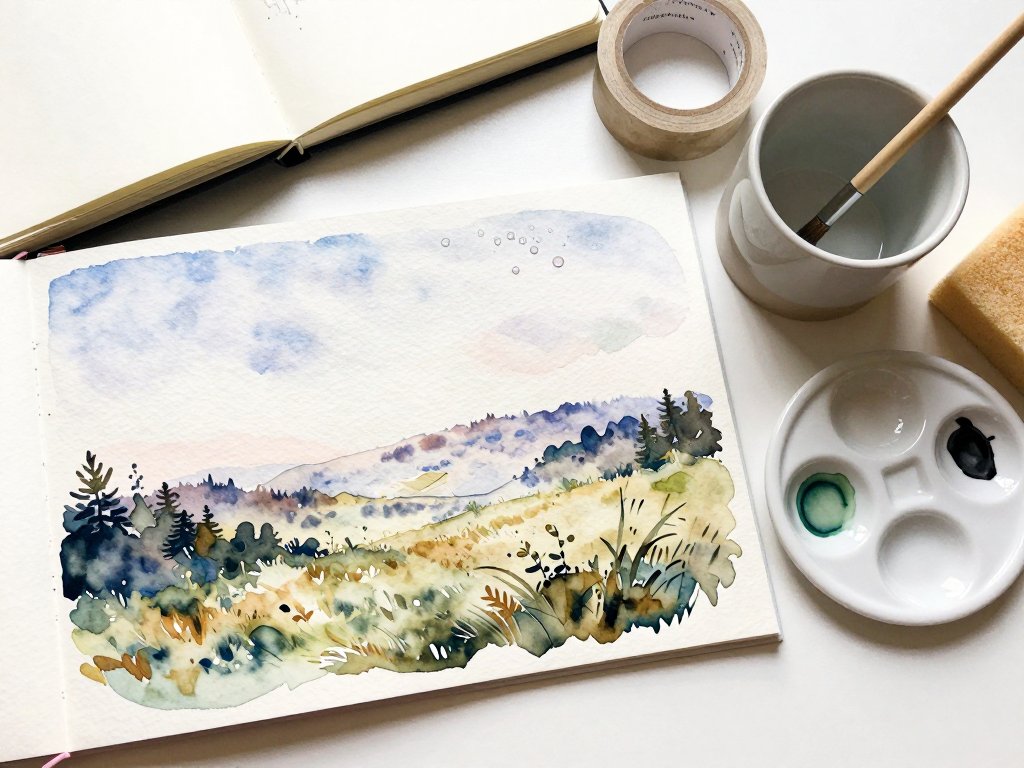
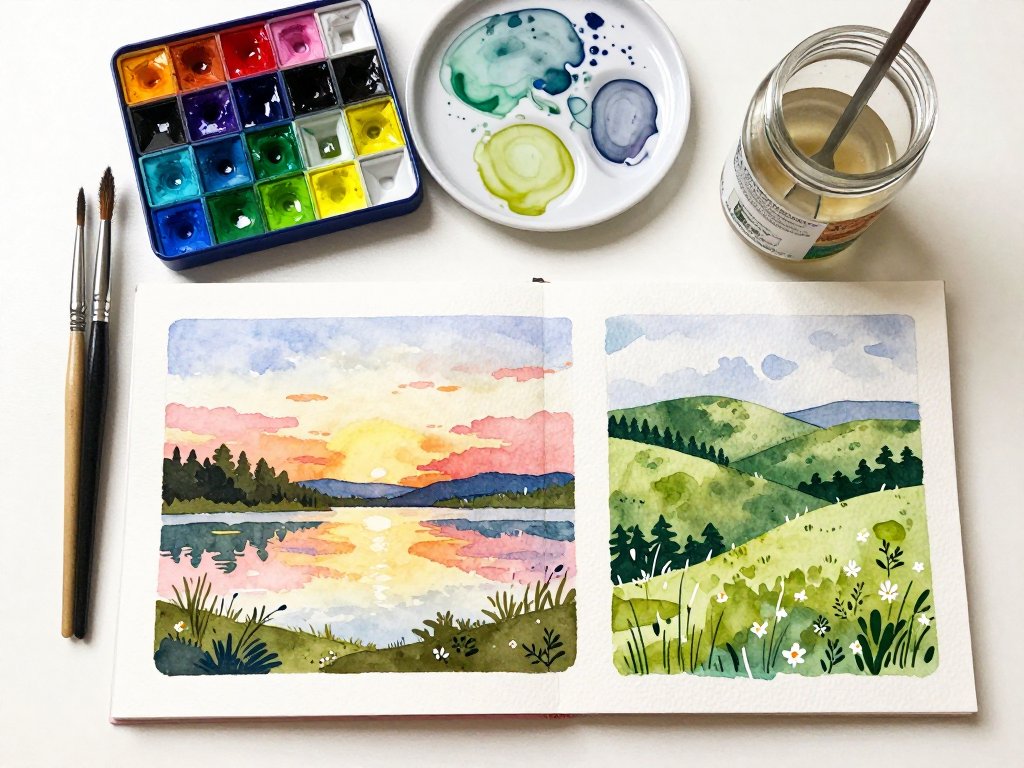
Rolling hills are a study in layers, and they teach the technique that will serve you in almost every landscape you ever paint: overlapping washes.
Step one: plan your hills. Mentally divide your paper into three or four bands of hills, each one behind the last. The hills in the distance are the lightest and most blue-gray; the hills closest to you are the greenest and darkest.
Step two: paint from back to front. Start with the farthest hill, mixing a pale blue-green — mostly blue with a touch of yellow.
Paint its shape across the paper and let it dry completely. Then mix a slightly stronger green and paint the next hill, overlapping the bottom edge of the first.
Let that dry. Continue forward, each hill a little deeper and more saturated in color.
Step three: add the foreground. The closest hill gets the richest green. While it is still damp, drag a few darker strokes along its lower edge to suggest dips and folds in the land.
Add a lone tree or a tiny farmhouse with your liner brush, and the scale of the scene suddenly becomes real.
Step four: the sky. A simple sky — pale blue fading to almost white at the horizon — completes the painting without stealing attention from the hills. Add a couple of soft clouds with a damp brush if you like.
This tutorial is wonderfully forgiving because hills have no straight edges. If a line wobbles, it simply looks like a more natural landscape.
Tutorial 3: A Lake at Golden Hour
There is nothing quite like a lake at sunset, and it is easier to paint than you might think. This tutorial is all about warm colors, soft edges, and reflections.
Step one: the sunset sky. Wet the sky area and lay down bands of color, starting with pale yellow at the horizon and moving up through orange to a soft pink or lavender.
Let the bands melt into each other. While the sky is still damp, add the sun as a small, brighter area of yellow, softened with a clean damp brush.
Step two: the water. The reflection is the magic part. Paint the water with the same colors as the sky, but in slightly darker, more muted versions, and pull them downward in short horizontal strokes to suggest ripples.
Because the sun's reflection sits directly below the sun, leave a vertical strip of pale yellow running down the water.
Step three: the shore. Paint a dark, simple shape along the bottom and sides for the treeline and shore. A mix of deep blue and a little burnt sienna makes a lovely dark that recedes naturally. Let this dry.
Step four: highlights. With white gouache, add a few bright dashes across the water to catch the last light, and a small warm dot where a cabin window glows in the dusk. Stand back and admire your golden hour.
Sunset paintings are the ones that make people stop and ask, "Did you really paint that?" The answer, happily, is yes.
Tutorial 4: A Cottage Garden in Bloom
Flowers can feel intimidating, but a cottage garden is actually one of the most forgiving subjects in paint, because real cottage gardens are gloriously messy. We are not aiming for botanical accuracy; we are aiming for the happy, tumbling feeling of a garden in June.
Step one: the background. Wash a soft, warm green over the lower two-thirds of your paper. While it is damp, dab in a few patches of deeper green and a little yellow to suggest sunlit leaves. Let it dry.
Step two: the flower clusters. Using the end of your brush or a small sponge, dab clusters of color — pink, blue, lavender, white — across the green.
Do not paint individual petals. Just make soft, rounded dabs of paint, leaving little gaps of green between them.
This is called a dry-brush or dabbing technique, and it instantly reads as a mass of blooms.
Step three: the stems. With your liner brush and a darker green, paint a few simple stems rising from the bottom of the garden, threading between the flower clusters. Add a few leaves along the stems with short, curved strokes.
Step four: the details. Once the dabs are dry, add a few crisper flowers on top — a white daisy with a yellow center, a red poppy, a lavender sprig. These few detailed blooms against the soft dabs create depth and delight.
This is the tutorial that works beautifully with children, by the way. Dabbing flowers is satisfying for small hands, and the results are always cheerful.
Tutorial 5: Misty Mountains at Dawn
Our final landscape is misty mountains, and it introduces one of the loveliest principles in painting: atmospheric perspective. The simple version is that air makes distant things paler, bluer, and fuzzier, and you can use that to create deep, believable space.
Step one: the far mountains. Paint the most distant range with a very pale, blue-gray wash — mostly water, a little pigment. The shapes should be soft and simple, like sleeping giants. Let them dry.
Step two: the middle range. Mix a slightly stronger blue-gray with a hint of purple and paint a second range in front, overlapping the first. These mountains are a touch darker and slightly more defined, but still soft at the edges.
Step three: the near mountains. For the closest range, use a deeper blue with a whisper of green, and paint the shapes with a little more confidence. Add a few vertical strokes of darker color where trees cling to the slopes.
Step four: the mist and the foreground. While the lower area of the paper is still damp, lay a pale wash over the foreground to suggest low-lying mist.
When everything is dry, add a dark foreground strip of trees and a small lake or path with your liner brush.
The contrast between the dark foreground and the pale distance will make the mountains feel miles away.
Misty mountains are also a wonderful subject for tiny paintings. Try this tutorial on a postcard-sized piece of paper, and you will have a set of beautiful handmade cards for birthdays and thank-yous.
Gentle Tips for Painting Outside
Once you have tried a few of these tutorials at the kitchen table, I hope you will take your paints outside.
Painting in the open air — what artists call plein air painting — is one of the great joys of summer, and the light is so much more alive than anything under a lamp.
- Keep it small. A postcard or A5 pad is perfect outdoors. You can finish a small painting in twenty minutes, before the light changes or the kids get restless.
- Choose your moment. Early morning and late afternoon have the most beautiful light. Midday sun flattens shadows and can be harsh on your paper.
- Strap things down. A breeze will steal your paper towels and knock over your water jar. Weigh everything down or use a clip-on water cup.
- Shade your paper. Sit with your back to the sun or under a tree, so glare does not hide your colors.
- Take a photo too. Snap a reference photo of your scene before you start, so you can finish details at home if the light moves on without you.
Remember, there is no wrong way to do this. A painting that captures the feeling of a summer afternoon is a success, whether it took ten minutes or an hour.
Conclusion
Last summer, I finally painted the lake at my grandmother's cottage — the golden light, the pale sand, the quiet water — and I hung it in my kitchen.
Every time I pass it, I am back on that dock, six years old and holding a jam jar of lightning bugs.
That is the gift these paints give you: the ability to hold onto the seasons and the places you love.
Start with the beach, or the hills, or whichever scene calls to you. Keep your paints where you can see them, and give yourself permission to paint badly sometimes. The joy is in the doing, and every painting teaches you something the last one could not.
When you are ready for more, try painting the view from your own window, a favorite park, or the flowers on your kitchen table. The same gentle techniques — soft washes, layered hills, and trusting the paint — will carry you through any scene summer offers.